iOS offers a collection of neatly designed UI elements in UIKit, which a developer can then use to create a catchy-looking UI.
In this blog post, we’ll discuss the elements that provide blur effects, or materials, as defined in the Human Interface Guidelines. These elements are used by apps and iOS alike.
The first example where this can be seen in action, and perhaps the one most viewed by users, is that of notification banners. The blur effects used on notification banners help them stand out when compared to their surrounding elements, thereby pointing the user to important content they should interact with. But we also see blur effects used in app folders on the Home screen and even in Notification Center widgets.
Using Blur Effects
Blur effects can be added using the UIVisualEffectView API. To do this, create a UIVisualEffectView and add it to the view hierarchy over the background content. The content needs to be added as a subview of the contentView of the initially added UIVisualEffectView element. The most important part of this is to set the effect of the visual effect view element. There are two options: UIBlurEffect and UIVibrancyEffect.
UIBlurEffect adds a blur over the content underneath the visual effect view and has been around since iOS 8. Meanwhile, UIVibrancyEffect makes the content under the visual effect view more prominent. This has also been available since iOS 8. However, Apple mentioned in the documentation for UIVibrancyEffect that the effect is meant to be used as a subeffect by adding it in the contentView of a visual effect view with a UIBlurEffect to make the actual contents appear vivid. We will get to the characteristics of these effects after our code sample below.
Adding a Blur Effect
To add a blur effect, do the following:
// Add the `UIVisualEffectView` to the view hierarchy.
let visualEffectView = UIVisualEffectView(effect: nil)
visualEffectView.translatesAutoresizingMaskIntoConstraints = false
view.addSubview(visualEffectView)
// Add appropriate constraints for the `visualEffectView`.

// Add your content to the visual effect view.
let contentView = makeMyFancyPrimaryContentView()
visualEffectView.contentView.addSubview(contentView)
// Add constraints for your `contentView`.

// Finally, set the appropriate blur effect for the visual effect view.
visualEffectView.effect = UIBlurEffect(style: .systemMaterial)
// Add the `UIVisualEffectView` to the view hierarchy.
UIVisualEffectView *visualEffectView = [[UIVisualEffectView alloc] initWithEffect:nil];
visualEffectView.translatesAutoresizingMaskIntoConstraints = NO;
[self.view addSubview:visualEffectView];
// Add appropriate constraints for the `visualEffectView`.

// Add your content to the visual effect view.
UIView *contentView = [self makeMyFancyPrimaryContentView];
[visualEffectView.contentView addSubview:contentView];
// Add constraints for your `contentView`.

// Finally, set the appropriate blur effect for the visual effect view.
visualEffectView.effect = [UIBlurEffect effectWithStyle:UIBlurEffectStyleSystemMaterial];
Adding a Vibrancy Effect
To add a vibrancy effect, do the following:
// A vibrancy effect needs an underlying blur effect.
// Add the initial `UIVisualEffectView` to the view hierarchy.
let blurEffectView = UIVisualEffectView(effect: nil)
blurEffectView.translatesAutoresizingMaskIntoConstraints = false
view.addSubview(blurEffectView)
// Add appropriate constraints for the `blurEffectView`.

// Create your desired blur effect.
let blurEffect = UIBlurEffect(style: .systemMaterial)

// Set the created blur effect for the visual effect view.
blurEffectView.effect = blurEffect

// Create a `UIVibrancyEffect` using the above created blur effect.
let vibrancyEffect = UIVibrancyEffect(blurEffect: blurEffect, style: .fill)

// Add a new `UIVibrancyEffectView` to the `contentView` of the earlier added `UIVisualEffectView`.
let vibrancyEffectView = UIVisualEffectView(effect: vibrancyEffect)
vibrancyEffectView.translatesAutoresizingMaskIntoConstraints = false
blurEffectView.contentView.addSubview(vibrancyEffectView)
// Add appropriate constraints for the `vibrancyEffectView`.

// Add the content that should be made more vibrant.
let contentView = makeMyFancyPrimaryContentView()
vibrancyEffectView.contentView.addSubview(contentView)
// Add constraints for your `contentView`.
// A vibrancy effect needs an underlying blur effect.
// Add the initial `UIVisualEffectView` to the view hierarchy.
UIVisualEffectView *blurEffectView = [[UIVisualEffectView alloc] initWithEffect:nil];
blurEffectView.translatesAutoresizingMaskIntoConstraints = NO;
[view addSubview:blurEffectView];
// Add appropriate constraints for the `visualEffectView`.

// Create your desired blur effect.
UIBlurEffect *blurEffect = [UIBlurEffect effectWithStyle:UIBlurEffectStyleSystemMaterial];

// Set the created blur effect for the visual effect view.
blurEffectView.effect = blurEffect;

// Create a `UIVibrancyEffect` using the above created blur effect.
UIVibrancyEffect *vibrancyEffect = [UIVibrancyEffect effectForBlurEffect:blurEffect style:UIVibrancyEffectStyleFill];

// Add a new `UIVibrancyEffectView` to the `contentView` of the earlier added `UIVisualEffectView`.
UIVisualEffectView *vibrancyEffectView = [[UIVisualEffectView alloc] initWithEffect:vibrancyEffect];
vibrancyEffectView.translatesAutoresizingMaskIntoConstraints = NO;
[blurEffectView.contentView addSubview:vibrancyEffectView];
// Add appropriate constraints for the `vibrancyEffectView`.

// Add the content that should be made more vibrant.
UIView *contentView = [self makeMyFancyPrimaryContentView];
[vibrancyEffectView.contentView addSubview:contentView];
// Add constraints for your `contentView`.
Blur Effect Styles
In iOS 13, we saw the introduction of Dark Mode. However, some of the effect styles that were available before iOS 13 are not dynamic, making them appear the same (light) in Dark Mode. As a result, they are not particularly useful when both modes need to be supported, as the styling won’t match the surrounding views.
Fortunately, UIBlurEffectStyle has new styles that came out with iOS 13 which change with the system appearance. These new styles not only update a blur effect based on the selected UI mode (dark/light), but they also have a new blur effect that is more in line with styles used in the system UI. Additionally, there are standalone styles that provide the same blur effect, but they will always be light/dark regardless of the selected user interface mode.
| Adaptable Modern Effects | Light | Dark |
|---|---|---|
| .systemUltraThinMaterial: Adds an ultra-thin blur effect between the underlying background and foreground content. Works with light and dark appearances. Available from iOS 13 onward (not available on watchOS and tvOS yet). .systemUltraThinMaterialLight: Same as .systemUltraThinMaterial, but the effect is always light (even with dark appearance). .systemUltraThinMaterialDark: Same as .systemUltraThinMaterial, but the effect is always dark (even with light appearance). |
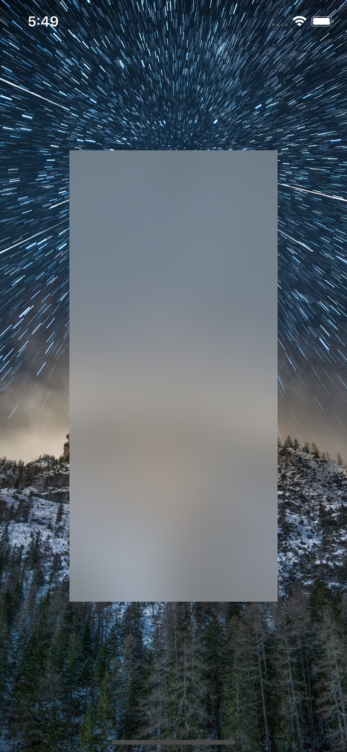 |
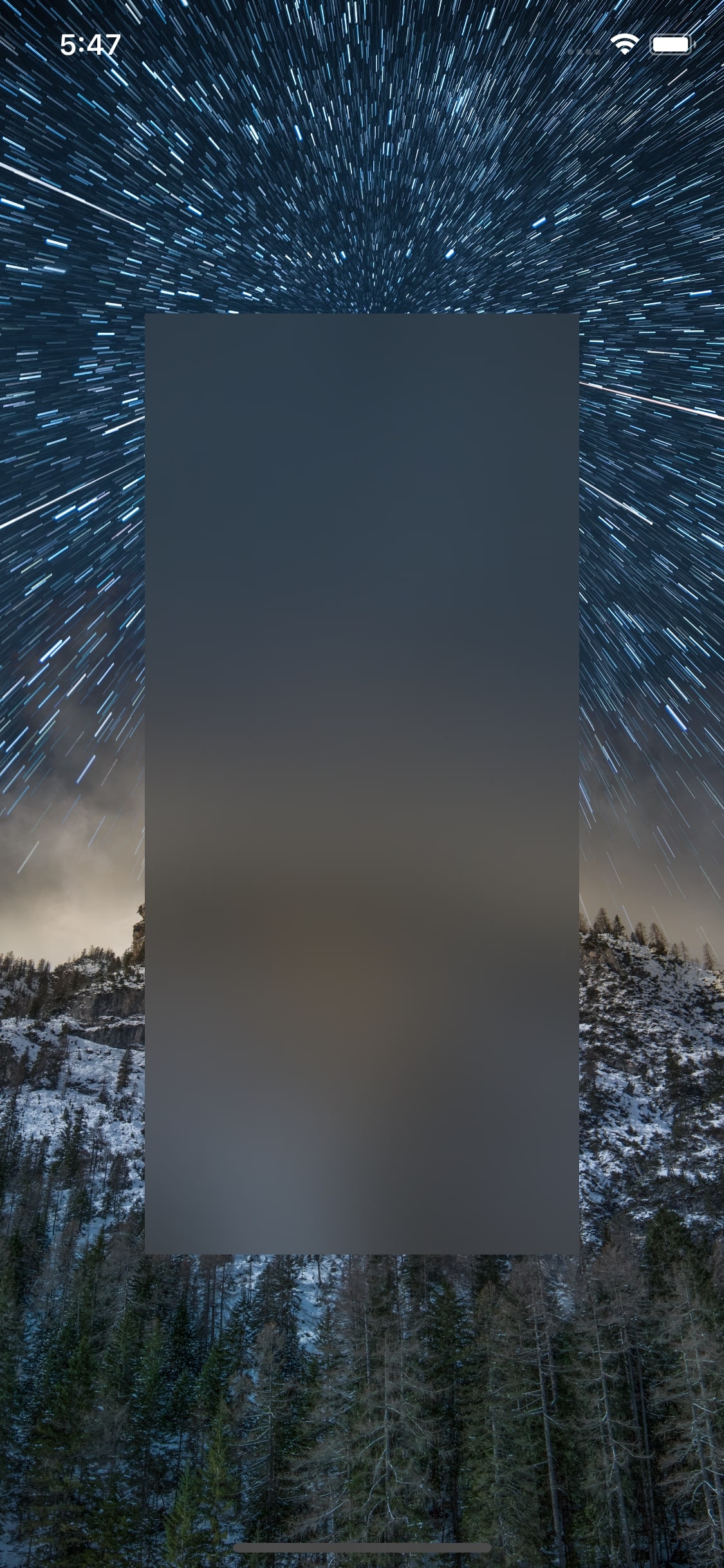 |
| .systemThinMaterial: Adds a thin blur effect between the underlying background and foreground content. Works with light and dark appearances. .systemThinMaterialLight: Same as .systemThinMaterial, but the effect is always light (even with dark appearance). .systemThinMaterialDark: Same as .systemThinMaterial, but the effect is always dark (even with light appearance). |
 |
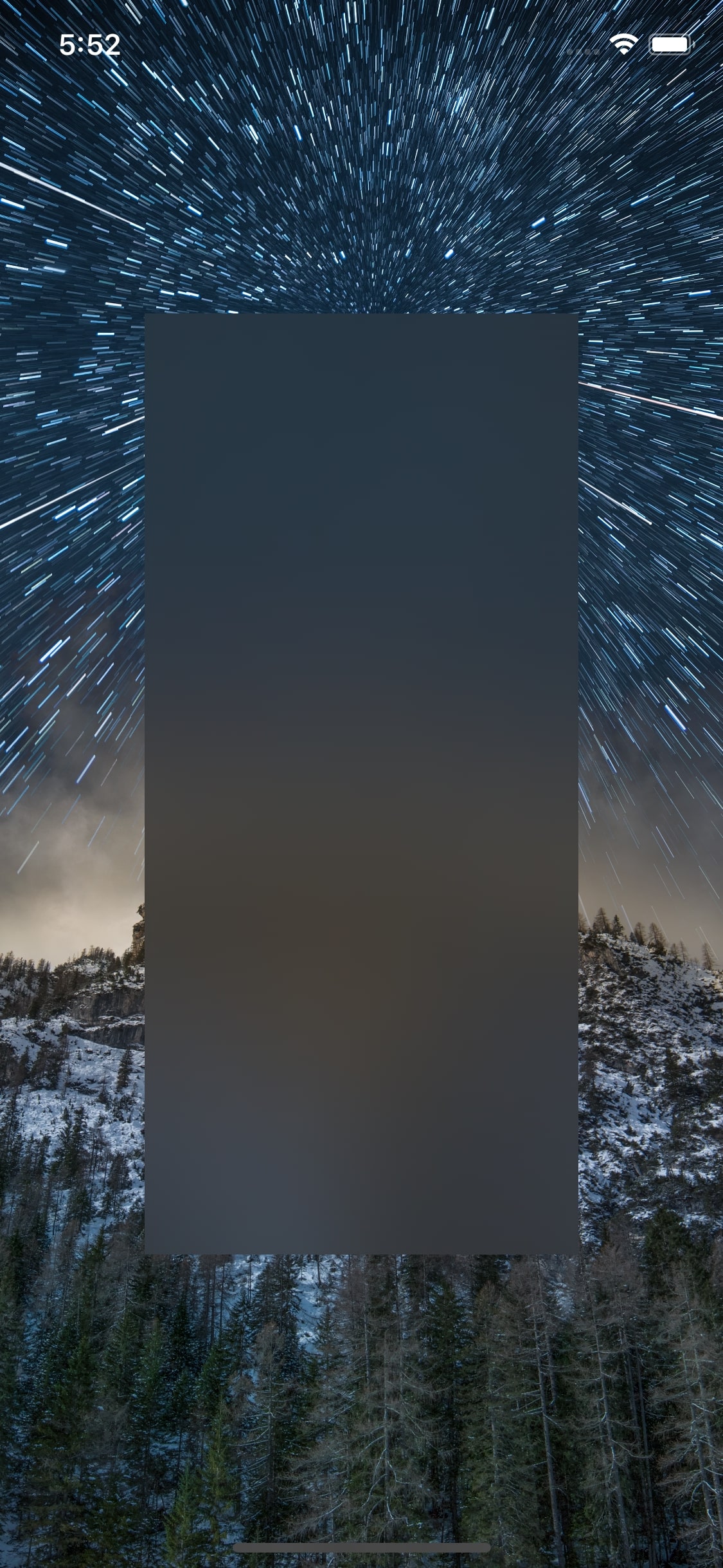 |
| .systemMaterial: Adds a blur effect with a normal thickness that’s the same as the default system thickness. Works with light and dark appearances. .systemMaterialLight: Same as .systemMaterial, but the effect is always light (even with dark appearance). .systemThinMaterialDark: Same as .systemThinMaterial, but the effect is always dark (even with light appearance). |
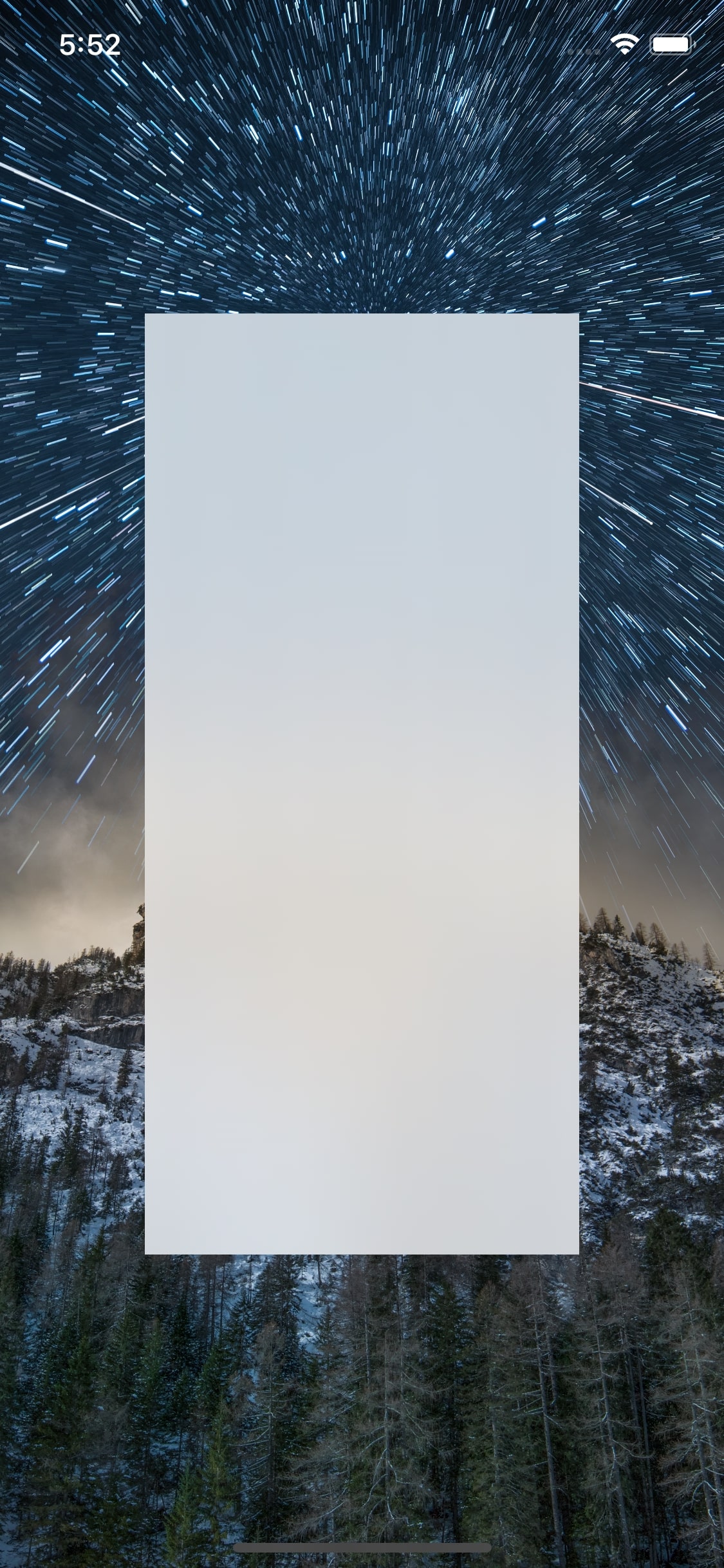 |
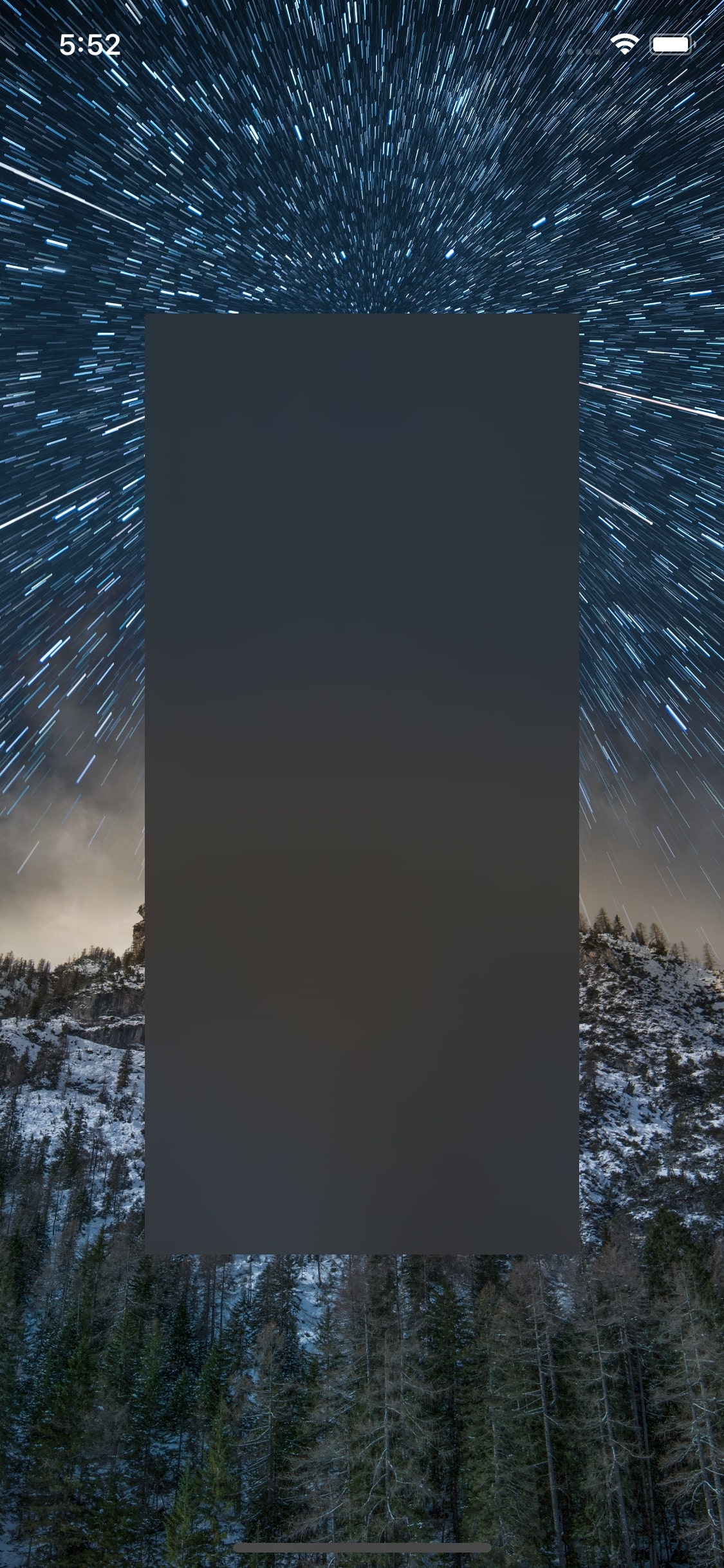 |
| .systemThickMaterial: Adds a blur effect thicker than the normal thickness. Works with light and dark appearances. .systemThickMaterialLight: Same as .systemThickMaterial, but the effect is always light (even with dark appearance). .systemThickMaterialDark: Same as .systemThickMaterial, but the effect is always dark (even with light appearance). |
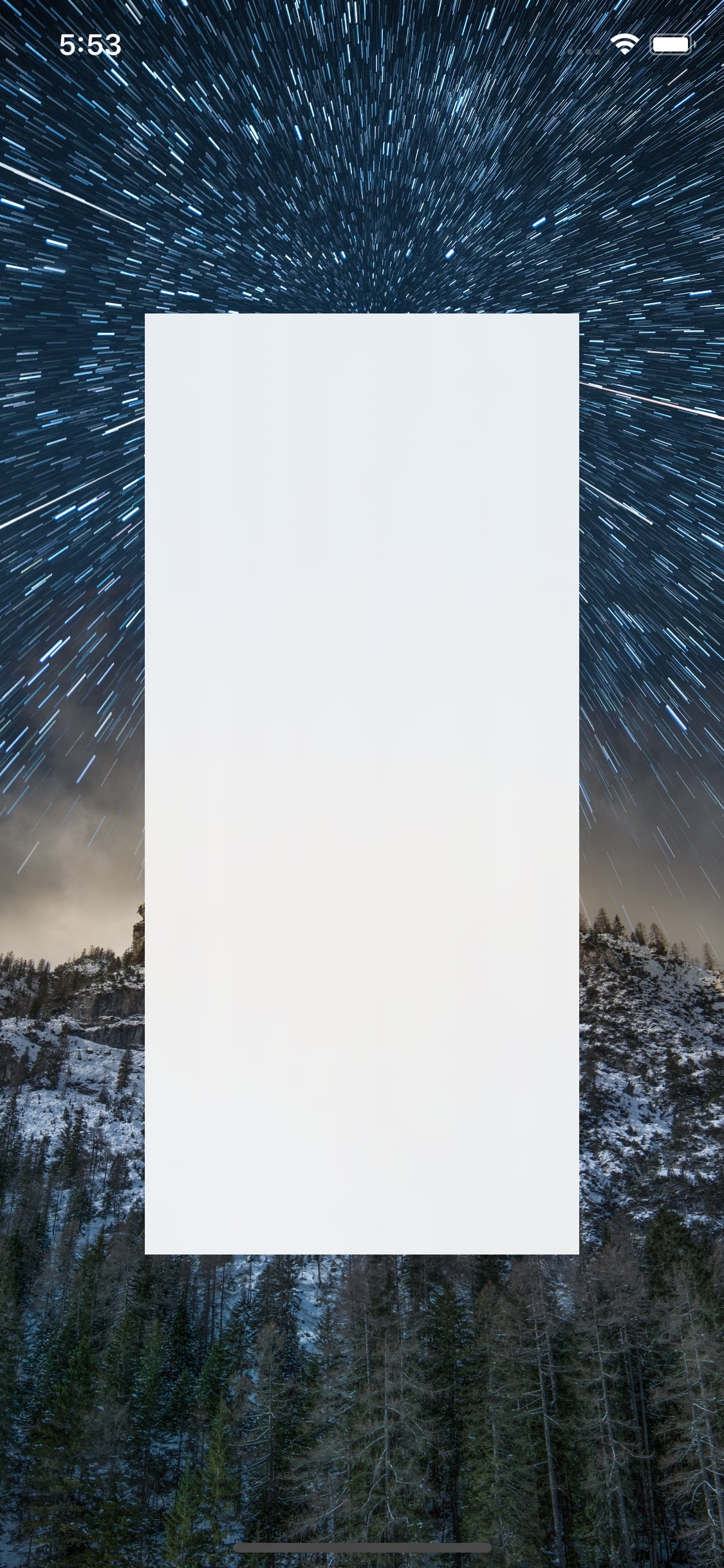 |
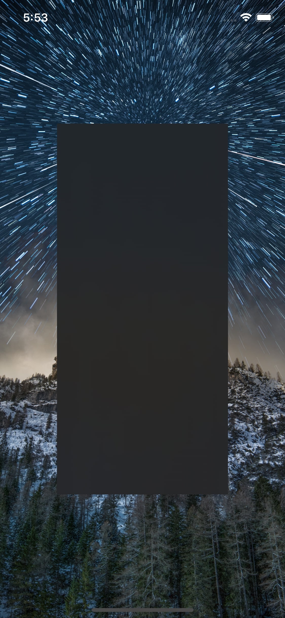 |
| .systemChromeMaterial: Adds a blur effect resembling the system’s chrome. Works with light and dark appearances. .systemChromeMaterialLight: Same as .systemChromeMaterial, but the effect is always light (even with dark appearance). .systemChromeMaterialDark: Same as .systemChromeMaterial, but the effect is always dark (even with light appearance). |
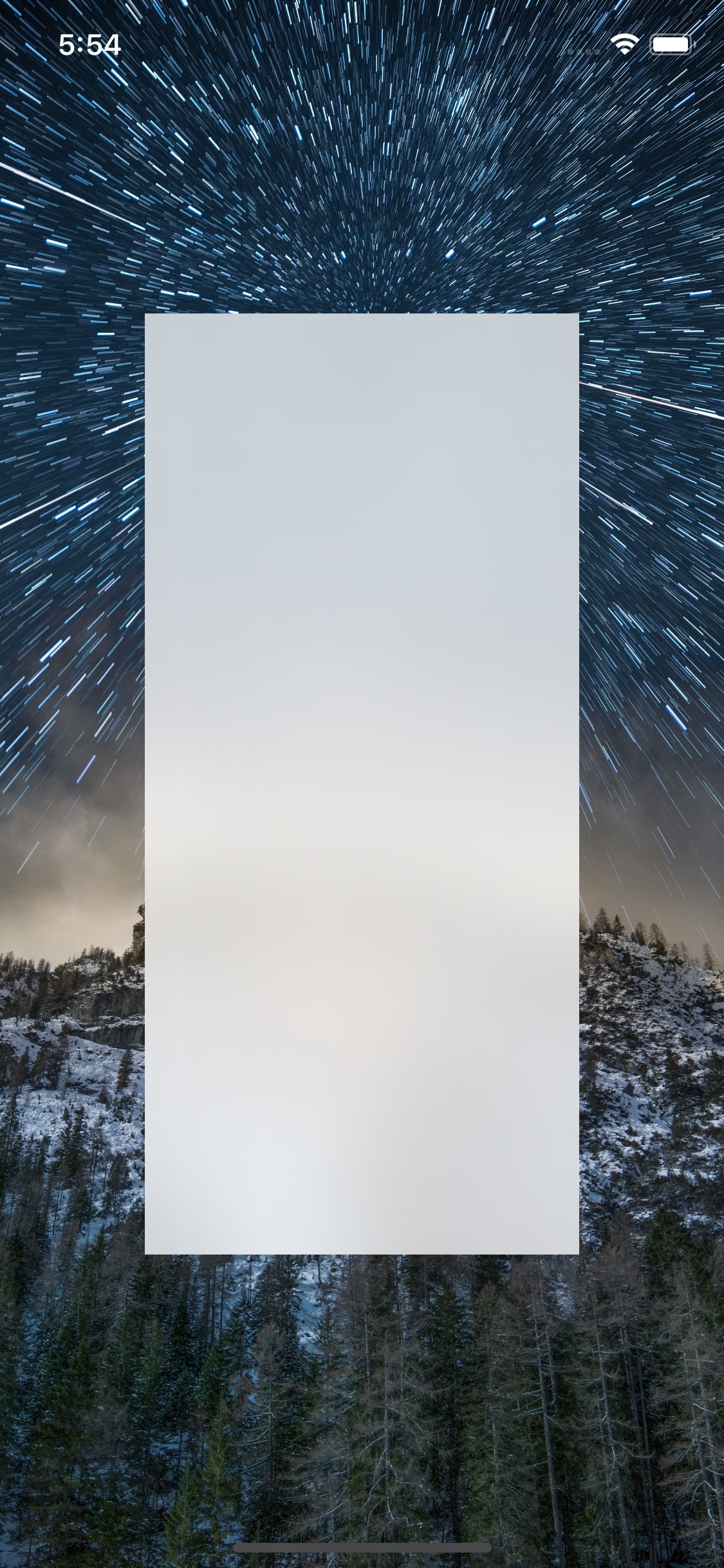 |
 |
The background image used in the screenshots is by Massimiliano Morosinotto on Unsplash.
Below is the list of the traditional blur effect styles. We are not attaching screenshots for them since they have been around for a few years now, and also because using the modern effects is the correct way forward.
| Blur Effect Style | Description |
|---|---|
| .extraLight | This has a lighter hue than the underlying background content. It does not adapt to Dark Mode. Available from iOS 10 onward. |
| .light | This has a hue area approximately the same as the underlying background content. It does not adapt to Dark Mode. Available from iOS 10 onward. |
| .dark | This has a darker hue than the underlying background content. It does not adapt to Dark Mode. Available from iOS 10 onward. |
| .extraDark | This is darker compared to the effect with .dark. It does not adapt to Dark Mode. Available from iOS 10 onward. |
| .regular | This uses the .light effect with light appearance and the .dark effect with dark appearance. |
| .prominent | This uses the .extraLight for light mode, .dark on iOS, and .extraDark on tvOS for Dark Mode. Available from iOS 10 onward. |
Vibrancy Effect Styles
UIVibrancyEffectStyle has styles for labels based on the type of the content (primary, secondary, tertiary, quaternary). For larger views having multiple subviews, it has fill effect styles, again based on the type of the content shown in it (primary, secondary, tertiary).
| Vibrancy Effect Style | Description |
|---|---|
| .label | Used for effects containing labels that have primary content. |
| .secondaryLabel | Used for effects containing labels that have secondary content. |
| .tertiaryLabel | Used for effects containing labels that have tertiary content. |
| .quaternaryLabel | Used for effects containing labels that have quaternary content. |
| .fill | Used for effects containing larger areas filled with primary content. |
| .secondaryFill | Used for effects containing larger areas filled with secondary content. |
| .tertiaryFill | Used for effects containing larger areas filled with tertiary content. |
| .separator | Used for effects containing separator lines. |
All the above vibrancy effects are compatible with light and dark appearances and available only from iOS 13 onward.
| Blur Effect | Vibrant Effect |
|---|---|
 |
 |
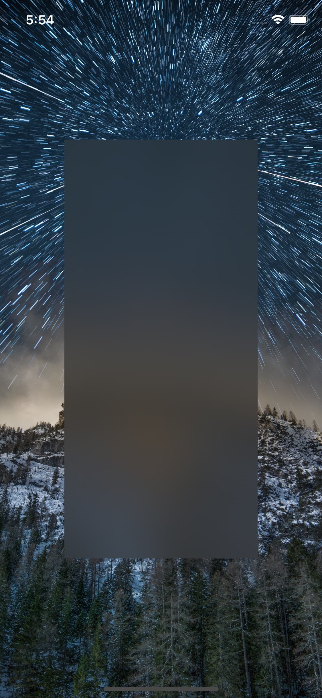
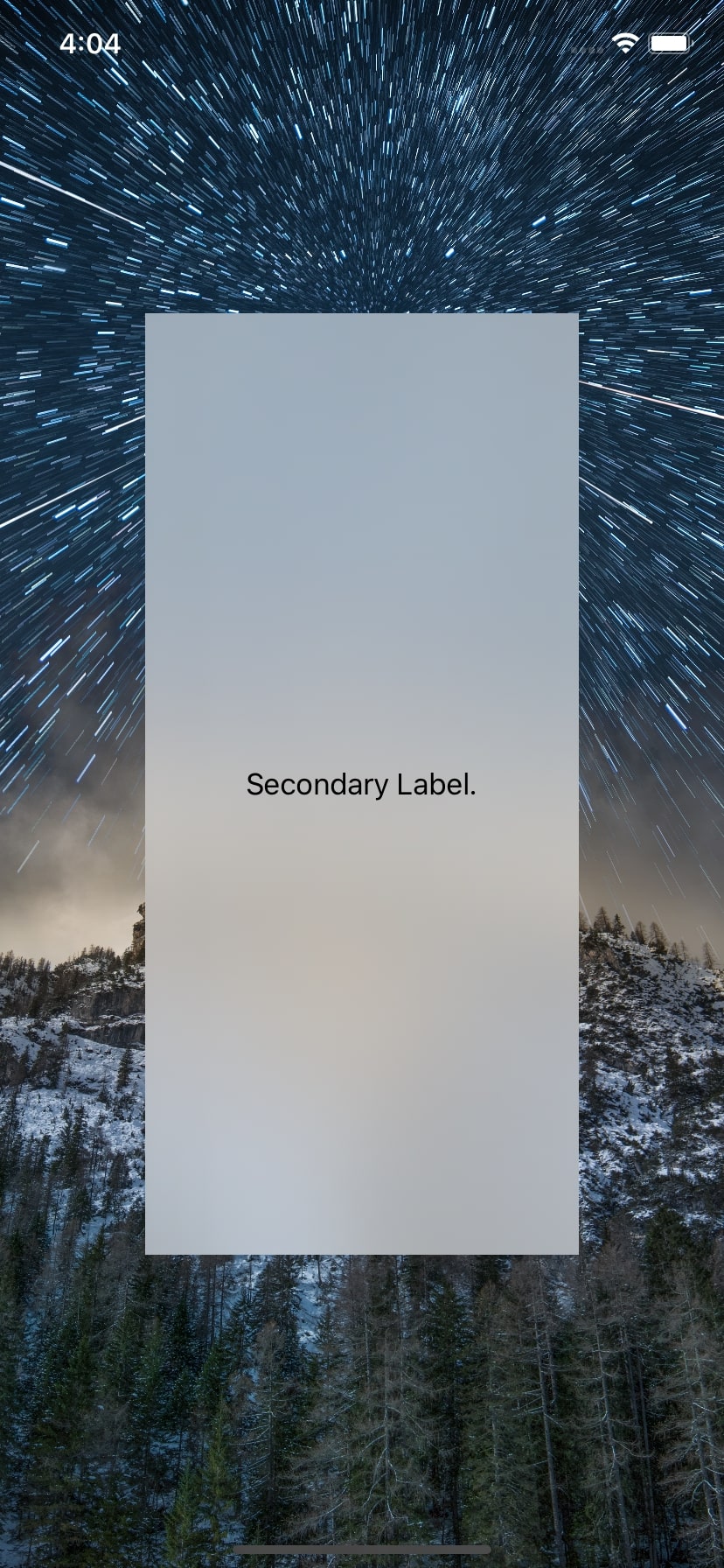
The content of the blur effect in the second screenshot has a lower contrast. A .secondaryLabel vibrancy effect is added on top of the blur effect, which is the same as the blur effect from the first screenshot. This is because the content has to match the system’s secondary content style.
Challenges of Picking the Appropriate Effect Style
Consider the case of overlaid bars, such as the scrubber bar at the bottom and the tab bar at the top in the PSPDFViewController. The rendered PDF page can extend underneath these bars, and so the effect style had to be chosen carefully to ensure the visibility of the contents of the overlaid bars.
If you look at the screenshots below, the one on the left side uses .systemThinMaterial. We decided not to use this, since it allows the content underneath it to pass through, thereby decreasing the visibility of the text in the tab bars.
For our SDK, we need to have a universal solution that can work with any kind of content rendered underneath. Blurs look snazzy in a design, but it is easy to end up with poor legibility. Meanwhile, using thicker materials is safer in terms of the legibility of content. Since we were already using the thicker system material (.systemThickMaterial) for the navigation and scrubber bars, we had to ensure that the selected tab bar was distinguishable from the other bars and also from the navigation bar above. So we decided to go with the style similar to the system (.systemMaterial) to ensure legibility of the content underneath.
| Rejected Effect Material | Shipped Effect Material |
|---|---|
 |
 |
This can be seen in the above screenshots. The rejected blur effect is applied to the tab bar, which is not selected, and as a result, it almost blends into the navigation bar above.
Conclusion
In this post, we discussed the different blur effects and blur effect styles available on iOS. We also gave examples of how to use them and shared some challenges we encountered in picking the appropriate effect.
There are no hard and fast rules as to which blur effect style should be picked. If your effect is added over static content, then you can simply cycle through the styles and pick the one that suits you best.
When it comes to adding a blur effect over dynamic content, it can take more than a few tries to get it right. However, it is well worth the time to pick the correct effect and effect style to not only get a great look but also ensure legibility.
FAQ
What are blur effect materials in iOS?
Blur effect materials in iOS are visual effects that apply a blur to the background content, creating a frosted glass-like appearance. These effects enhance the user interface by adding depth and focusing attention on the foreground content.How can I implement blur effects in my iOS app?
You can implement blur effects in your iOS app usingUIVisualEffectView with UIBlurEffect. Initialize a UIVisualEffectView with the desired UIBlurEffect style (light, dark, or extra light) and add it to your view hierarchy.
What are the different types of blur effects available in iOS?
iOS provides several blur effect styles, including.light, .dark, .extraLight, and more. Each style applies a different level of blur and color tint to match various design needs.
What are some common use cases for blur effects in iOS apps?
Common use cases include background blurring for modals, pop-ups, and overlays to maintain focus on the primary content while still providing context of the background.How can I customize the intensity of the blur effect in iOS?
You can customize the intensity of the blur effect by layering multipleUIVisualEffectView instances with different blur styles or by using a custom blur implementation with Core Image filters for more granular control.


