The thumbnail view mode in PSPDFKit for iOS shows a bird’s-eye view of many pages in a PDF document, allowing users to quickly find a particular page. However, the problem with this is that we need to decide what size the items in the grid should be. It may sound simple, but pages can have any aspect ratio, and the containing view could be any size. Whatever the situation is, we want the thumbnail grid to look its best.
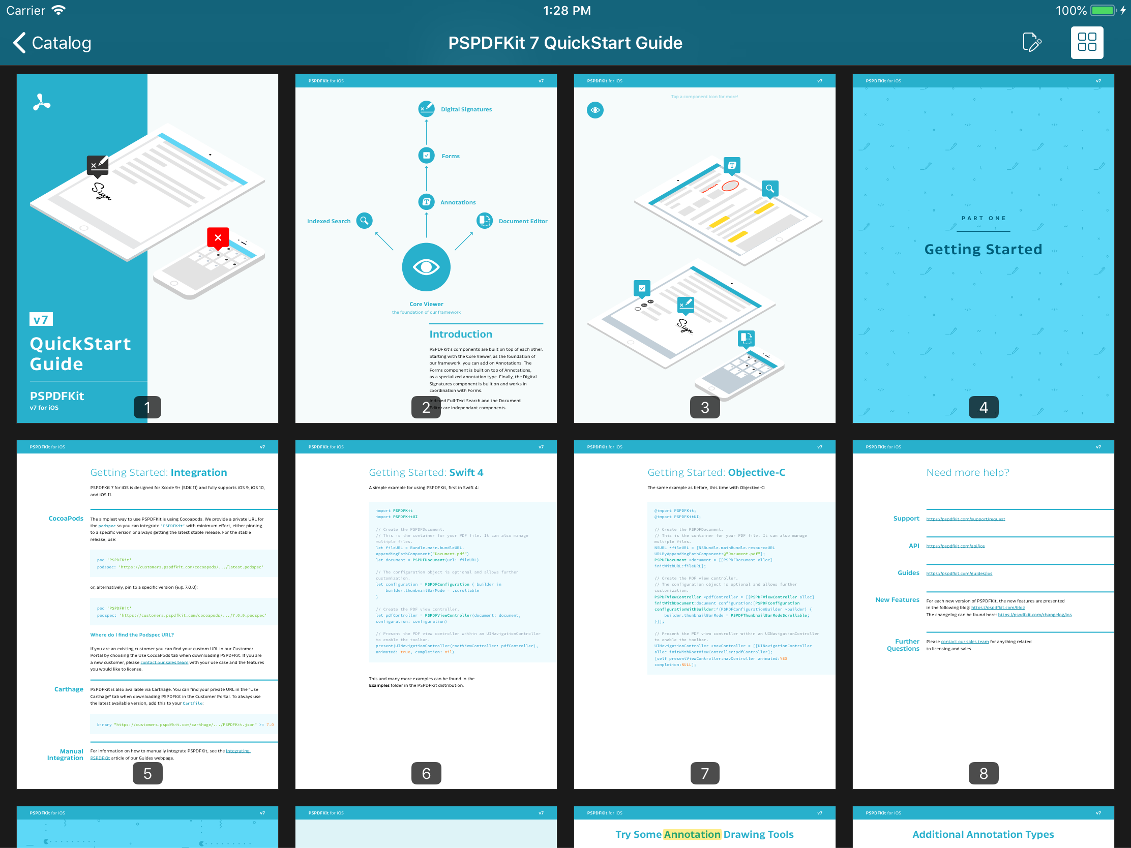
The size of pages in a PDF might be portrait US letter, landscape A4, very wide for a poster, very tall and thin for a brochure, or any other aspect ratio. Meanwhile, iOS devices come with a large range of screen sizes — from the iPhone 4S up to the 12.9” iPad Pro — which might be in portrait or landscape, or even in Split View on iPad.
We wanted a solution that sizes the pages appropriately in any situation. The requirements were:
-
The grid should show enough items at once to give a useful overview of the document, but not so many as to be overwhelming.
-
The horizontal and vertical space between items should be the same in order to fill the available space and give a pleasing, even appearance.
The challenge was to come up with a procedure to dynamically calculate the item size so that these requirements were met.
Although PDFs may contain pages with a mix of aspect ratios, as a simplification, we’ll assume all the pages have the same aspect ratio because this is the most common case.
The thumbnail view in PSPDFKit for iOS uses UICollectionView with UICollectionViewFlowLayout. However, the calculations used here are broadly applicable to other grid views on any platform.
Simple Approaches
First, let’s look at some simpler ways of choosing thumbnail sizes that failed to meet our requirements.
Fixed Size
This is the easiest approach to implement — just set the itemSize on a UICollectionViewFlowLayout:
layout.itemSize = CGSize(width: 100, height: 100)
At this size, both portrait and landscape don’t look too bad on iPhone.

However, the above presents too many items on large screens. Many PDFs aren’t long enough to make displaying this number of items worthwhile, and for longer documents, there are then so many pages shown at once that it becomes overwhelming.

It also doesn’t consider the page aspect ratio at all, leading to different horizontal and vertical inter-item spacing, which looks messy.
Fixed Width
We can slightly improve on using a fixed size by using a fixed width and setting the height using the page aspect ratio:
let width: CGFloat = 100
let pageAspectRatio = pageSize.width / pageSize.height
layout.itemSize =  CGSize(width: width, height: round(width / pageAspectRatio))
This corrects the uneven spacing, but otherwise, it has the same limitations as using a fixed size.

The thumbnails are still too small on iPad.

Fixed Number of Columns
We can divide the available width into a fixed number of columns. At this point, we should move this logic into a function:
func automaticThumbnailSize(for pageSize: CGSize, containerSize: CGSize, interitemSpacing: CGFloat) -> CGSize {
    let numberOfColumns: CGFloat = 3

    // Account for padding between the thumbnails.
    let availableWidth = containerSize.width - interitemSpacing * (numberOfColumns - 1)

    // Divide the available width between the columns.
    let thumbnailWidth = availableWidth / numberOfColumns

    // We want to handle pages of any aspect ratio (portrait or landscape).
    let pageAspectRatio = pageSize.width / pageSize.height

    // Calculate the thumbnail size using the width and page aspect ratio. Round to a number of points or pixels.
    // We must round down. Otherwise, the thumbnails might not fit.
    return CGSize(width: floor(thumbnailWidth), height: floor(thumbnailWidth / pageAspectRatio))
}
This adjusts thumbnail sizes appropriately between large and small screens. However, the thumbnails come out much bigger in landscape than in portrait, resulting in too few in landscape, or too many on iPad in portrait Split View.


The Solution
The approach we found that worked well at meeting the requirements was to start from a desired number of items to show at once, and then work backward to calculate the item size needed to achieve this number. The target number of items we decided on is 10.
Let’s walk through it:
/// Returns an appropriate size for page thumbnails.
///
/// - Parameters:
///   - pageSize: The page size. Only the aspect ratio is considered, so the units are irrelevant.
///   - containerSize: The size of the container that will display the thumbnails in points.
///   - interitemSpacing: The padding between thumbnails in points.
/// - Returns: An appropriate size for thumbnails in points.
func automaticThumbnailSize(for pageSize: CGSize, containerSize: CGSize, interitemSpacing: CGFloat) -> CGSize {
    // What is the total available area?
    let containerArea = containerSize.width * containerSize.height

    // We decided showing around 10 thumbnails is enough to be useful without being overwhelming.
    let approximateNumberOfThumbnailsToShow: CGFloat = 10

    // Divide the available area by the target number of thumbnails
    // to get the approximate area for each thumbnail.
    let approximateThumbnailArea = containerArea / approximateNumberOfThumbnailsToShow

    // We want to handle pages of any aspect ratio (portrait or landscape).
    let pageAspectRatio = pageSize.width / pageSize.height

    //                   area = width × height
    //           aspect ratio = width / height
    // => area × aspect ratio = width × width
    let approximateThumbnailWidthSquared = approximateThumbnailArea * pageAspectRatio

    // Take the square root of the value calculated above to find the approximate thumbnail width.
    let approximateThumbnailWidth = sqrt(approximateThumbnailWidthSquared)

    // We need a whole number of columns.
    let numberOfColumns = round(containerSize.width / approximateThumbnailWidth)

    // Account for padding between the thumbnails.
    let availableWidth = containerSize.width - interitemSpacing * (numberOfColumns - 1)

    // Divide the available width between the columns.
    let thumbnailWidth = availableWidth / numberOfColumns

    // Finally we have the thumbnail size. Round to a number of points or pixels.
    // We must round down. Otherwise, the thumbnails might not fit.
    return CGSize(width: floor(thumbnailWidth), height: floor(thumbnailWidth / pageAspectRatio))
}
This handles any container size, e.g. it’s ready for new screen sizes and Split View configurations on iPad.
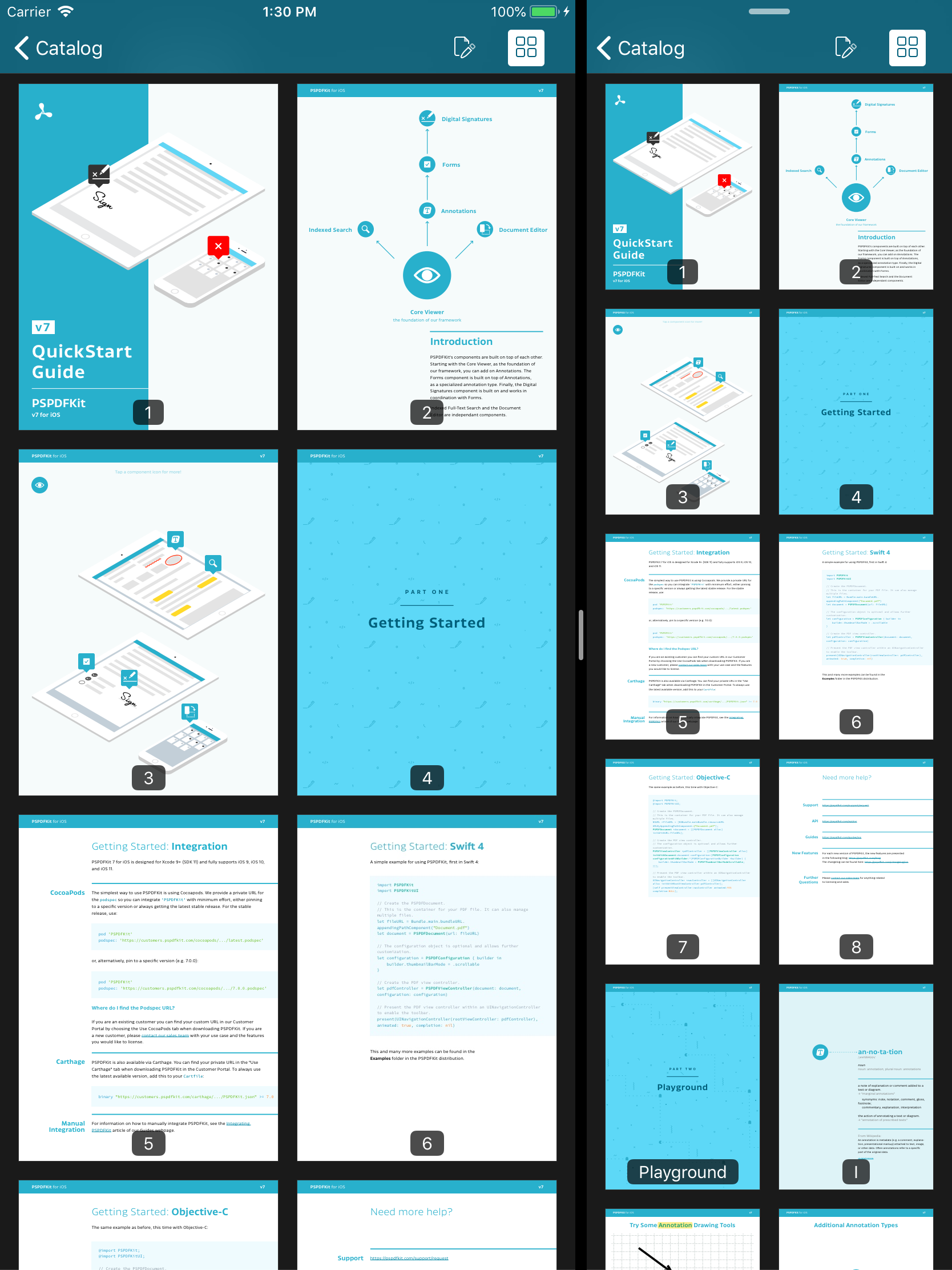
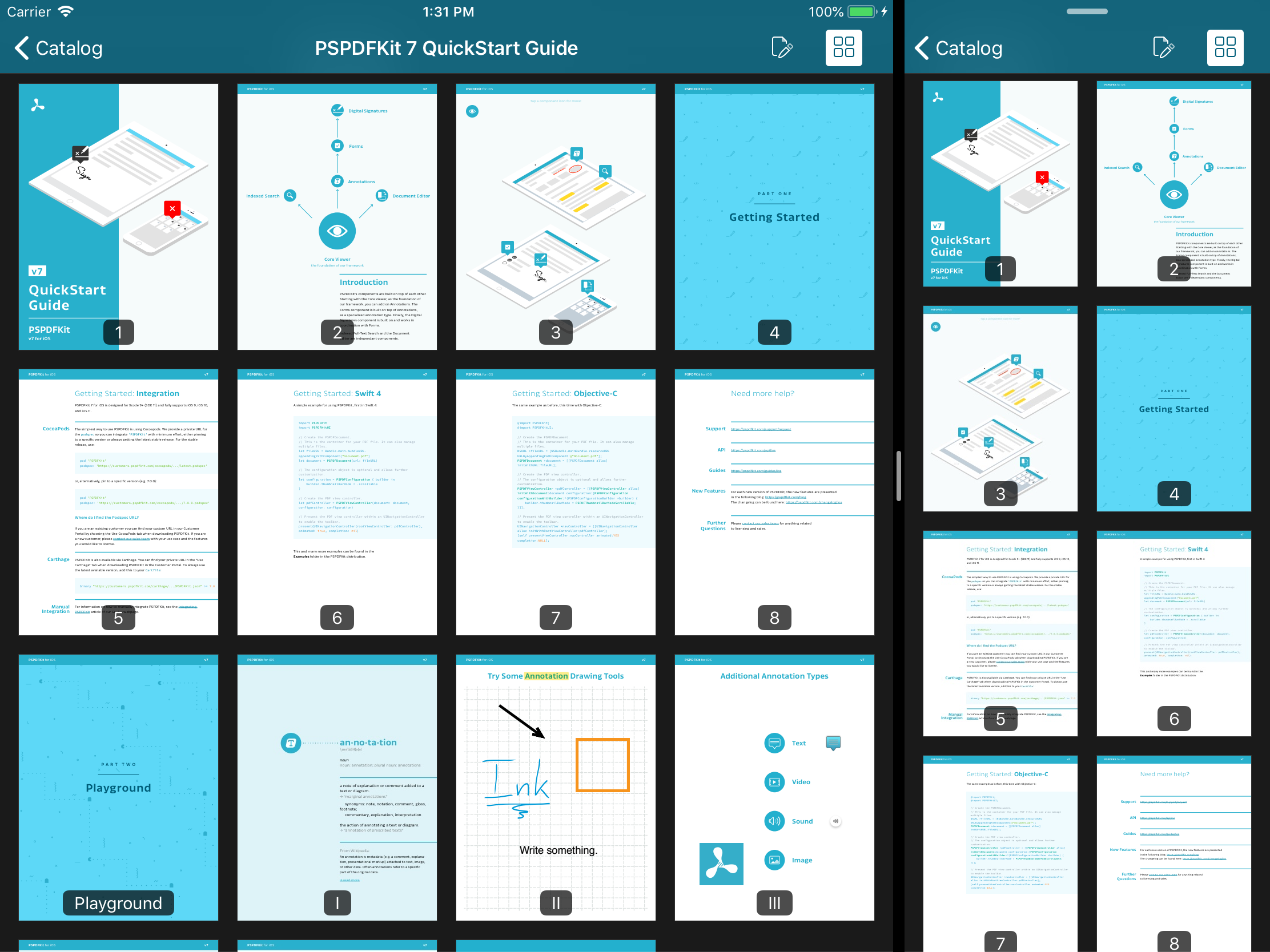
It also deals well with any page aspect ratio, automatically varying the number of columns to keep the thumbnails at a reasonable size. This even means going down to just one column in extreme cases.
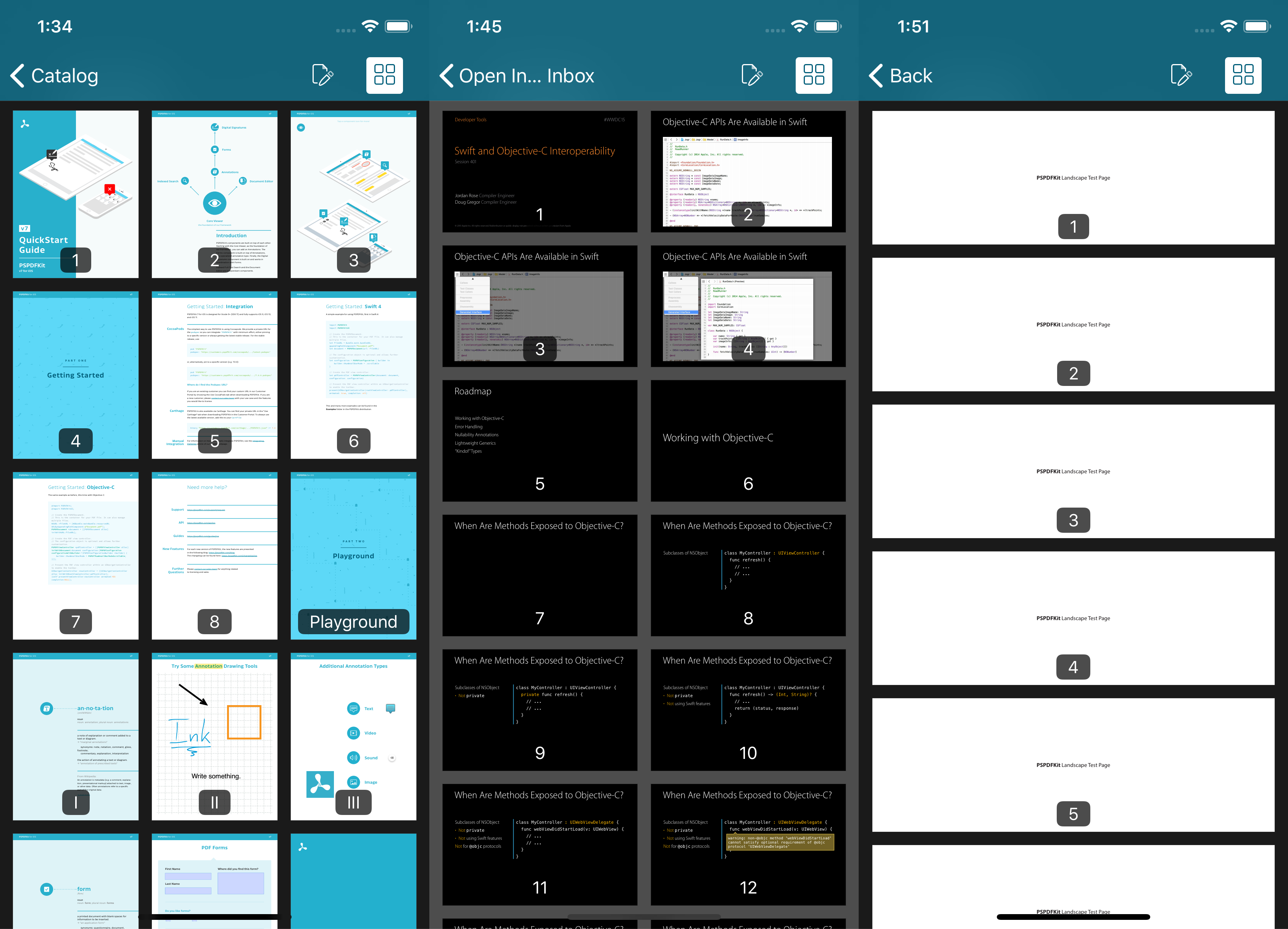
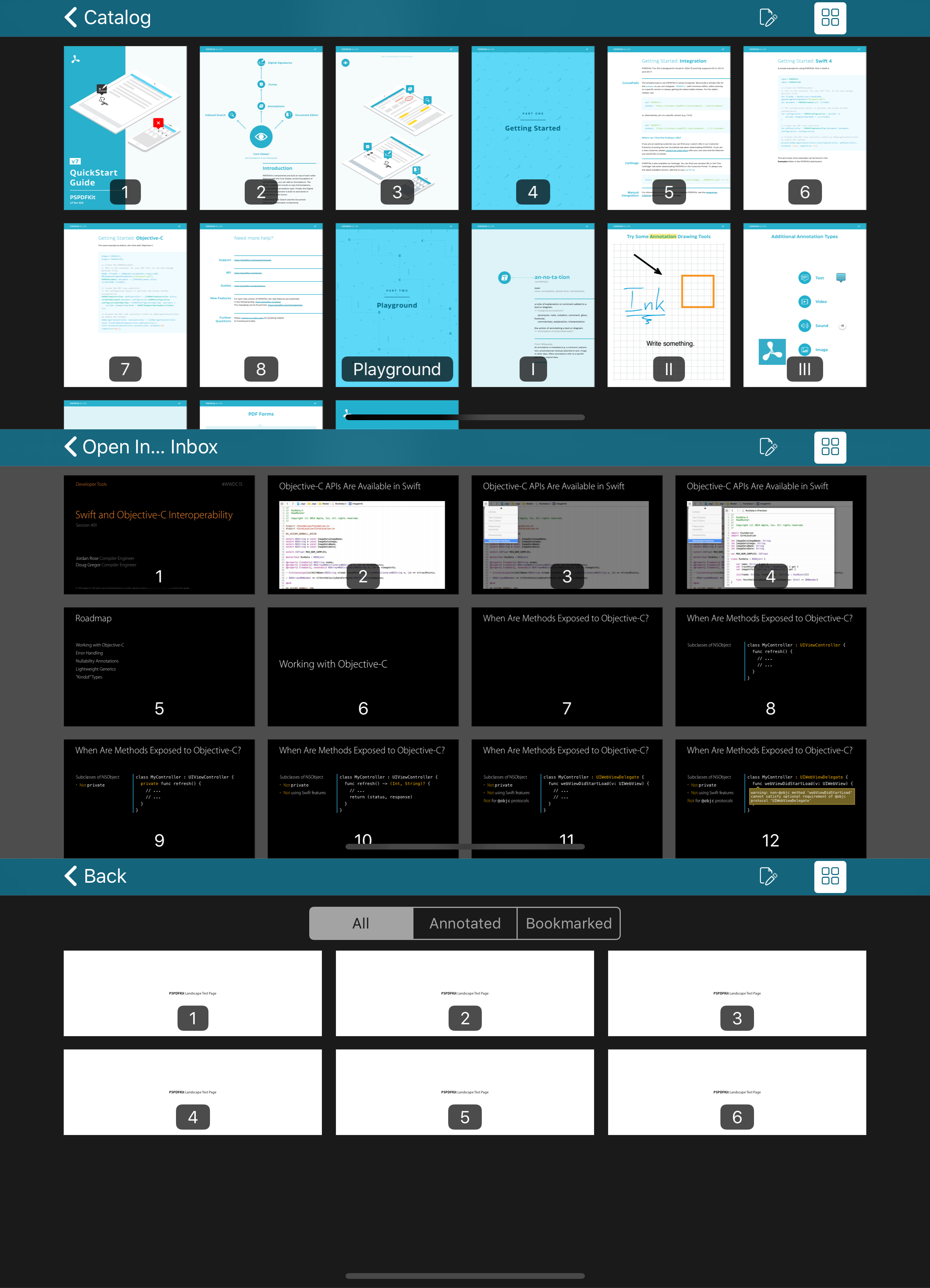
In this post, we’ve seen how the thumbnail view mode in PSPDFKit for iOS handles the problem of picking an appropriate thumbnail size for pages of any aspect ratio in any containing view size. This is achieved by initially aiming to display 10 items at once and calculating back to find the thumbnail size.


