HTML Template Design for Generating PDFs
Designing a webpage and designing for the PDF Generation component differ slightly. Therefore, special considerations should be taken, although for most cases, a generated page mirrors what is seen in the browser.
This guide highlights what you should consider when designing a PDF with HTML and CSS.
To help design your PDF, we advise using Chrome or another Chromium-based browser to preview your page. To further enhance the design experience, you can use the Chrome DevTools to resize your viewport to match your desired page size. Another useful test can be to use the print option in Chrome. The print dialog will display a print preview of your desired size and give a better indication of how elements will be laid out on a page.
Layout reflow
In HTML, when an element flows off the screen, in most instances the element is reflowed to reside on a new line, or a horizontal scroll bar is shown. Whereas reflowing is possible with PDF Generation, the use of scrollbars on a fixed page size is not.
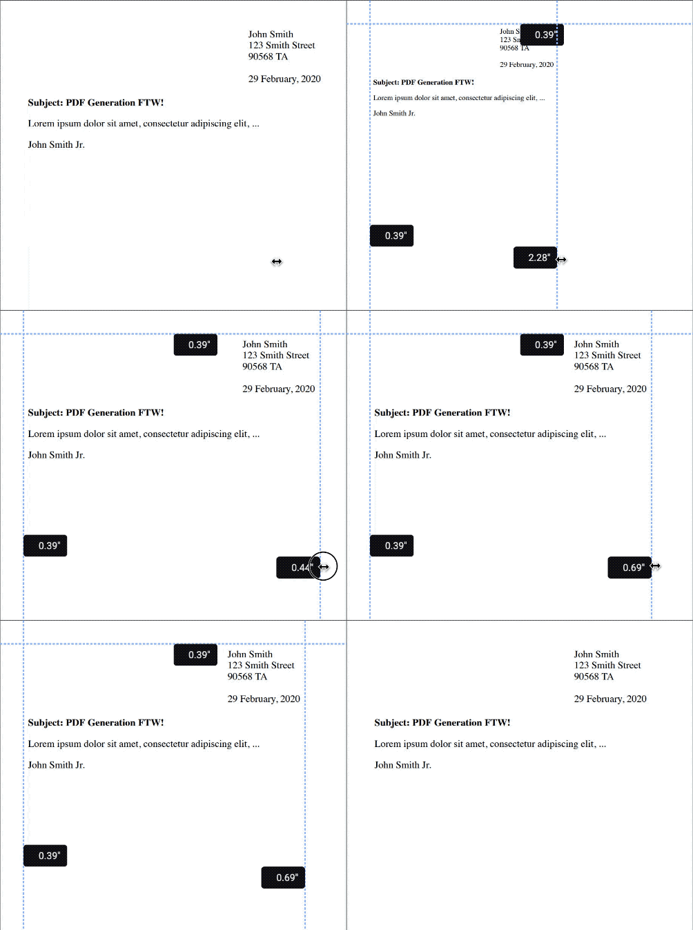
If a fixed width element wider than the page width minus the pages margins is defined, the page content will be scaled. Although this may be desirable to ensure all the content fits on the page, it can cause confusion when it comes to the resizing of elements, especially fonts.
The GIF below shows the rescaling in effect.

To avoid scaling, we highly recommend a responsive HTML design and to avoid absolute values whenever possible.
CSS media type and queries
CSS files can specify different styles based upon the media type requested. When using a browser, it’s likely that the media type requested is screen.
For PDF Generation, we used a style based on the screen media type to closely replicate the rendering seen in a browser. Using the screen media type allows you to design your layout in Chrome prior to using the PDF Generation feature, and most elements and styles will render the same. For the optimum design experience, we advise that you set the page viewport to the page size you’ll be requesting in the PDF Generation schema.
Even though the screen media type is used, to save any CSS styling confusion, and for the sake of simplicity, we advise you to not to use any CSS media queries in your stylesheet.
Unit conversion
When converting from a webpage to PDF, unit conversion can become a little complicated. In some instances, it’s important to understand the exact units of a page or element in pixels, millimeters, and inches.
The generated PDFs from the PDF Generation component always use 72 DPI (dots per inch). Dots can be read as PDF points in this instance.
All dimensions specified in the PDF Generation schema are referenced in millimeters. The formula below shows how we convert millimeters to PDF points:
inches = mm * 25.4
PDF points = inches * 72
The value in millimeters is multiplied by 25.4 to obtain the measurement in inches, and then it’s multiplied by 72 (the DPI of the PDF) to get the PDF points.
To further complicate the matter, webpages work in 96 PPI, so to calculate the number of PDF points in web pixels, the following formula is required:
inches = {web_px} / 96
PDF points = inches * 72
It’s possible to rearrange the formulas above to work out the desired page width to pass in the PDF Generation schema. Hypothetically, let’s say a web element has a width of 800 px and it has to be displayed on page at its full scale:
(px / 96) * 25.4 = mm

(800 / 96) * 25.4 = 211.666 mm
The above formula tells you that you need a page width of at least 211.666 mm to display the element on the page. Otherwise, the entire page will be scaled. Remember to account for margins, as they’ll decrease the available content area.
To convert the above element size into PDF points, find the value in inches and then use 72 DPI to convert:
(800 / 96) * 72 = 600 PDF points
Page breaks
When designing HTML for webpages, there’s no concept of page breaks. However, like with printing, it may be desirable to insert page breaks to define a new PDF page.
Using the CSS properties page-break-after or page-break-before, it’s possible to force content onto a new page. The following example shows how to use a page break:
<div class="container">
  <div style="page-break-after: always">
    <p>I'm on the first page.</p>
  </div>
  <p>I'm on the second page.</p>
</div>
Repeating table headers
When your HTML contains a table, it might span multiple pages in the generated PDF. If you want the table header to be repeated on all the pages where the table appears, use the following CSS:
thead {
  display: table-header-group;
  break-inside: avoid;
}
Header and Footer
Please refer to the page header and footer guide to learn how to specify sections that repeat across all pages in the generated PDF.