The Android Drag-and-Drop Framework in Practice
Table of contents

The Android drag-and-drop framework provides you with the tools necessary to create components that allow your users to move data around an app using drag-and-drop gestures. The framework contains an API for handling the drag-and-drop logic, such as drag events, listeners, etc. In this article, we’ll show how it all works and share an example that showcases how to make the API work with the UI.
API Overview
We’ll quickly go through the APIs and the components that we’ll need to create the example app. See the Drag and Drop section(opens in a new tab) of the Android developers guide for the full documentation and more in-depth explanations.
States
A drag-and-drop action begins when a user performs a movement that the framework recognizes as a signal that data is being dragged. There are four steps (states) in the drag-and-drop process:
- Started — Once your application’s logic decides that the user should perform a drag (for example, on a long press), you call
startDrag(), which tells the system that the drag has started. After that, the system sends theACTION_DRAG_STARTED(opens in a new tab) event down to the drag event listeners for all theViewobjects in the current layout. - Continuing — The user continues the drag, and the system now sends
ACTION_DRAG_ENTERED(opens in a new tab) orACTION_DRAG_EXITED(opens in a new tab), depending on if the drag gesture entered or exited the bounds of the view to which the event is propagated. - Dropped — The user drops the dragged object/data, and the system sends the
ACTION_DROP(opens in a new tab) event to the listener of the view if the location of the drop event is inside that view’s bounding box. - End — The drag-and-drop operation has ended. All of the views that were listening for the drag-and-drop events now get the
ACTION_DRAG_ENDED(opens in a new tab) event.
These four states provide everything you need when it comes to updating the UI to match the drag-and-drop process and its result.
Listener and Callback Method
To receive the drag-and-drop events, the view needs to register a View.OnDragListener(opens in a new tab) on the View via View#setOnDragListener()(opens in a new tab). The View.OnDragListener(opens in a new tab) contains only one method, boolean onDrag(View v, DragEvent event)(opens in a new tab).
The first parameter you get in the onDrag() call is the view that received the event. The second parameter is the DragEvent(opens in a new tab) object, which contains all the information about the particular drag-and-drop event, including the location of the event, the drag action (state), and the data it carries. See the full documentation for all the methods. We will see how to use this in the example at the end.
Drag-and-Drop Shadow
During the drag-and-drop action, the framework provides you with the API that enables you to draw on top of the dragged point, thus creating the visual representation of the dragged data. For that, you have to extend the View.DragShadowBuilder(opens in a new tab) and pass it in the View#startDrag()(opens in a new tab) method. When creating the View.DragShadowBuilder(opens in a new tab), you can pass a view that will be used as the basis of the drag gesture shadow.
To get and alter the coordinates of the drag-and-drop gesture, you need to override the onProvideShadowMetrics(Point outShadowSize, Point outShadowTouchPoint)(opens in a new tab) method that gets you the size and the touch point, which you can then alter. They will then get propagated back to the system afterward. We’ll cover this more in the implementation.
The onDrawShadow(canvas: Canvas)(opens in a new tab) method gives you a canvas that you can now use to draw the shadow.
The Example
There’s no point in going too deep with the documentation of components, so we’ll jump right into the action and create an example that will try to cover most of this API and showcase the real power of this framework. You can always go back and check the full documentation to see if there’s anything that you might need that’s not covered here.
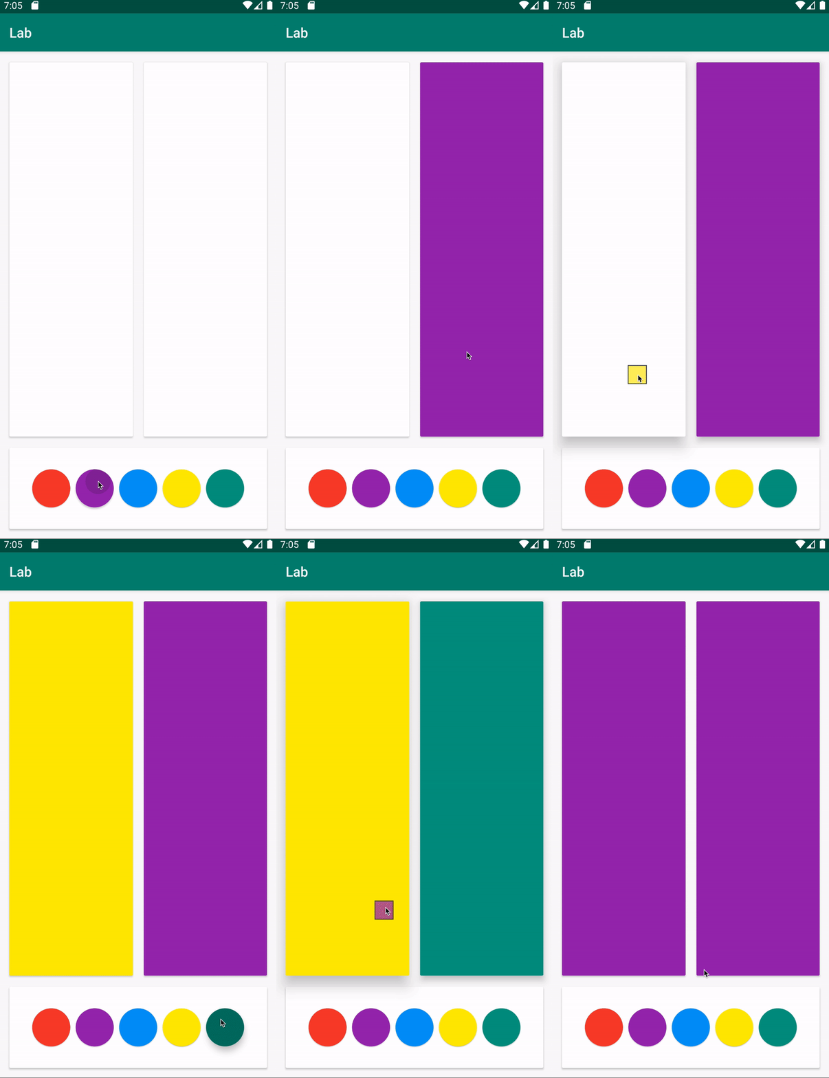
We will create a sample app where you can pick colors from a palette of five colors.

For the sake of simplicity, the entire app will only have one view/activity, and that’s MainActivity. First we need to define a layout for it in the XML, namely activity_main.xml:
<?xml version="1.0" encoding="utf-8"?><androidx.constraintlayout.widget.ConstraintLayout        xmlns:android="http://schemas.android.com/apk/res/android"        xmlns:tools="http://schemas.android.com/tools"        xmlns:app="http://schemas.android.com/apk/res-auto"        android:layout_width="match_parent"        android:layout_height="match_parent"        tools:context=".MainActivity">
    <View android:id="@+id/horizontalLine"          android:layout_width="match_parent"          android:layout_height="1px"          app:layout_constraintTop_toTopOf="parent"          app:layout_constraintBottom_toBottomOf="parent"          app:layout_constraintVertical_bias="0.8"/>
    <View android:id="@+id/verticalLine"          android:layout_width="1px"          android:layout_height="match_parent"          app:layout_constraintEnd_toEndOf="parent"          app:layout_constraintStart_toStartOf="parent"/>
    <androidx.cardview.widget.CardView            android:id="@+id/area1"            android:layout_width="0dp"            android:layout_height="0dp"            app:layout_constraintStart_toStartOf="parent"            android:layout_marginLeft="16dp"            android:layout_marginStart="16dp"            app:layout_constraintBottom_toTopOf="@+id/horizontalLine"            android:layout_marginTop="16dp"            app:layout_constraintTop_toTopOf="parent"            app:cardElevation="2dp"            app:layout_constraintEnd_toEndOf="@+id/verticalLine"            android:layout_marginEnd="8dp"            android:layout_marginRight="8dp"            android:layout_marginBottom="8dp"/>
    <androidx.cardview.widget.CardView            android:id="@+id/area2"            android:layout_width="0dp"            android:layout_height="0dp"            app:cardElevation="2dp"            app:layout_constraintStart_toEndOf="@+id/verticalLine"            app:layout_constraintEnd_toEndOf="parent"            android:layout_marginEnd="16dp"            android:layout_marginRight="16dp"            android:layout_marginTop="16dp"            app:layout_constraintTop_toTopOf="parent"            app:layout_constraintBottom_toTopOf="@+id/horizontalLine"            android:layout_marginBottom="8dp"            android:layout_marginLeft="8dp"            android:layout_marginStart="8dp"/>
    <androidx.cardview.widget.CardView            android:id="@+id/colorArea"            android:layout_width="0dp"            android:layout_height="0dp"            app:layout_constraintEnd_toEndOf="@+id/horizontalLine"            app:layout_constraintBottom_toBottomOf="parent"            app:layout_constraintStart_toStartOf="parent"            android:layout_marginLeft="16dp"            android:layout_marginStart="16dp"            android:layout_marginRight="16dp"            android:layout_marginEnd="16dp"            android:layout_marginBottom="16dp"            app:layout_constraintTop_toBottomOf="@+id/horizontalLine"            android:layout_marginTop="8dp">
        <LinearLayout                android:orientation="horizontal"                android:gravity="center"                android:layout_width="match_parent"                android:layout_height="match_parent">
            <com.google.android.material.floatingactionbutton.FloatingActionButton                    android:id="@+id/fabRed"                    android:layout_weight="1"                    android:layout_width="0dp"                    app:elevation="1dp"                    android:layout_height="wrap_content"                    android:layout_margin="4dp"                    android:clickable="true"                    android:longClickable="true"                    android:focusable="true"                    app:fabSize="normal"                    android:tag="#F44336"                    app:backgroundTint="#F44336"/>
            <com.google.android.material.floatingactionbutton.FloatingActionButton                    android:id="@+id/fabPurple"                    android:layout_weight="1"                    android:layout_width="0dp"                    app:elevation="1dp"                    android:layout_height="wrap_content"                    android:layout_margin="4dp"                    android:clickable="true"                    android:longClickable="true"                    android:focusable="true"                    app:fabSize="normal"                    android:tag="#9C27B0"                    app:backgroundTint="#9C27B0"/>
            <com.google.android.material.floatingactionbutton.FloatingActionButton                    android:id="@+id/fabBlue"                    android:layout_weight="1"                    android:layout_width="0dp"                    app:elevation="1dp"                    android:layout_height="wrap_content"                    android:layout_margin="4dp"                    android:clickable="true"                    android:longClickable="true"                    android:focusable="true"                    app:fabSize="normal"                    android:tag="#2196F3"                    app:backgroundTint="#2196F3"/>
            <com.google.android.material.floatingactionbutton.FloatingActionButton                    android:id="@+id/fabYellow"                    android:layout_weight="1"                    android:layout_width="0dp"                    app:elevation="1dp"                    android:layout_height="wrap_content"                    android:layout_margin="4dp"                    android:clickable="true"                    android:longClickable="true"                    android:focusable="true"                    app:fabSize="normal"                    android:tag="#FFEB3B"                    app:backgroundTint="#FFEB3B"/>
            <com.google.android.material.floatingactionbutton.FloatingActionButton                    android:id="@+id/fabGreen"                    android:layout_weight="1"                    android:layout_width="0dp"                    app:elevation="1dp"                    android:layout_height="wrap_content"                    android:layout_margin="4dp"                    android:clickable="true"                    android:longClickable="true"                    android:focusable="true"                    app:fabSize="normal"                    android:tag="#009688"                    app:backgroundTint="#009688"/>
        </LinearLayout>
    </androidx.cardview.widget.CardView>
</androidx.constraintlayout.widget.ConstraintLayout>
As you can see, we have two areas that we can paint: area1 and area2. Then we have the floating action buttons, which we’ve used as color palette elements, so you can drag them into the areas to paint them in the same color as the dragged button. Of course, you can and probably should use custom views if you implement the color picker in your own app.
Now, let’s go to our MainActivity, where we will implement all of the drag-and-drop logic. In this particular example, we want to activate a drag action when one of the floating action buttons has been long pressed. Once the dragging has started, we will increase the shadow of the areas that can be painted, and once you hover over one of those areas, the shadow will grow even larger, in order to provide feedback that the area below will be painted if you drop the color.
First we define these elevation values in our MainActivity:
class MainActivity : AppCompatActivity() { companion object { // Default card elevation. const val CARD_ELEVATION_DEFAULT_DP = 2F // Card elevation once the dragging has started. const val CARD_ELEVATION_DRAG_START_DP = 8F // Card elevation once the color is dragged over one of the areas. const val CARD_ELEVATION_DRAG_ENTER_DP = 16F }}Since we will activate the drag action once one of the floating action buttons has been pressed, we need to create a long-press listener. A description for each line is in the comments:
class MainActivity : AppCompatActivity() {
  private val onLongClickListener = View.OnLongClickListener { view: View ->    (view as? FloatingActionButton)?.let {
        // First we create the `ClipData.Item` that we will need for the `ClipData`.        // The `ClipData` carries the information of what is being dragged.        // If you look at the main activity layout XML, you'll see that we've stored        // color values for each of the FABs as their tags.        val item = ClipData.Item(it.tag as? CharSequence)
        // We create a `ClipData` for the drag action and save the color as plain        // text using `ClipDescription.MIMETYPE_TEXT_PLAIN`.        val dragData = ClipData(          it.tag as? CharSequence,          arrayOf(ClipDescription.MIMETYPE_TEXT_PLAIN),          item)
        // Instantiates the drag shadow builder, which is the class we will use        // to draw a shadow of the dragged object. The implementation details        // are in the rest of the article.        val myShadow = MyDragShadowBuilder(it)
        // Start the drag. The new method is called `startDragAndDrop()` instead        // of `startDrag()`, so we'll use it on the newer API.        if (Build.VERSION.SDK_INT >= Build.VERSION_CODES.N) {          it.startDragAndDrop(dragData, myShadow, null, 0)        } else {          it.startDrag(dragData, myShadow, null, 0)        }
        true    }    false  }
}
Now, let’s create an OnDragListener that we will set on our areas:
private val onDragListener = View.OnDragListener { view, dragEvent -> (view as? CardView)?.let { when (dragEvent.action) { // Once the drag event has started, we elevate all the views that are listening. // In our case, that's two of the areas. DragEvent.ACTION_DRAG_STARTED -> { it.cardElevation = CARD_ELEVATION_DRAG_START_DP.toDp(resources.displayMetrics) return@OnDragListener true } // Once the drag gesture enters a certain area, we want to elevate it even more. DragEvent.ACTION_DRAG_ENTERED -> { it.cardElevation = CARD_ELEVATION_DRAG_ENTER_DP.toDp(resources.displayMetrics) return@OnDragListener true } // No need to handle this for our use case. DragEvent.ACTION_DRAG_LOCATION -> { return@OnDragListener true } // Once the drag gesture exits the area, we lower the elevation down to the previous one. DragEvent.ACTION_DRAG_EXITED -> { it.cardElevation = CARD_ELEVATION_DRAG_START_DP.toDp(resources.displayMetrics) return@OnDragListener true } // Once the color is dropped on the area, we want to paint it in that color. DragEvent.ACTION_DROP -> { // Read color data from the clip data and apply it to the card view background. val item: ClipData.Item = dragEvent.clipData.getItemAt(0) val colorHex = item.text it.setCardBackgroundColor(Color.parseColor(colorHex.toString())) return@OnDragListener true } // Once the drag has ended, revert card views to the default elevation. DragEvent.ACTION_DRAG_ENDED -> { it.cardElevation = CARD_ELEVATION_DEFAULT_DP.toDp(resources.displayMetrics) return@OnDragListener true } else -> return@OnDragListener false } } false}In order to have some UI feedback, we’ll create a shadow for a drag gesture that will follow the finger. For that purpose, we extend View.DragShadowBuilder(opens in a new tab):
private class MyDragShadowBuilder(v: View) : View.DragShadowBuilder(v) {
  private val shadowBorder = ColorDrawable(Color.BLACK)
  private val shadow = ColorDrawable(Color.parseColor(v.tag.toString()))
  // Defines a callback that sends the drag shadow dimensions and touch point back to the system.  override fun onProvideShadowMetrics(size: Point, touch: Point) {    // First, we define the shadow width and height. In our example, it will be    // half of the size of the view that's been dragged.    val width: Int = view.width / 2    val height: Int = view.height / 2
    // The drag shadow is a `ColorDrawable`. This sets its dimensions to be the same as the    // `Canvas` that the system will provide. We leave some room (four pixels) for the shadow border.    shadow.setBounds(4, 4, width - 4, height - 4)    shadowBorder.setBounds(0, 0, width, height)
    // Sets the size parameter's width and height values.    // These get back to the system through the size parameter.    size.set(width, height)
    // Sets the touch point's position to be in the middle of the drag shadow.    touch.set(width / 2, height / 2)  }
  // Defines a callback that draws the drag shadow in a `Canvas` that the  // system constructs from the dimensions passed in `onProvideShadowMetrics()`.  override fun onDrawShadow(canvas: Canvas) {
    // Draws the border drawable first.    shadowBorder.draw(canvas)
    // Draws the actual shadow drawable onto the `Canvas` passed in    // from the system so that the shadow content is above its border.    shadow.draw(canvas)  }}
Lastly, we need to set the long-press listener on the floating action buttons and a drag listener on the areas that we can drop the color on:
override fun onCreate(savedInstanceState: Bundle?) {  super.onCreate(savedInstanceState)  setContentView(R.layout.activity_main)
  area1.setOnDragListener(onDragListener)  area2.setOnDragListener(onDragListener)
  fabRed.setOnLongClickListener(onLongClickListener)  fabBlue.setOnLongClickListener(onLongClickListener)  fabGreen.setOnLongClickListener(onLongClickListener)  fabPurple.setOnLongClickListener(onLongClickListener)  fabYellow.setOnLongClickListener(onLongClickListener)}
And there we have it: We’ve implemented an example similar to what was shown earlier in this post. We hope this helps you better understand the process and see how you can implement the Android drag-and-drop framework for your own use case.
Conclusion
The Android drag-and-drop framework provides you with a flexible yet powerful API for dragging data across your app. It allows you to handle all of the stages in the drag-and-drop process in a very convenient way — both in terms of data and the UI.
Your app might need a custom solution, but in most of the drag-and-drop implementations, this API will be sufficient; you might just have to figure out the best way to set it up for your needs.
Happy coding!


