Internationalization - Right to Left Support for Mobile Apps
Table of contents

Right to left support is something I always feared because it sounded like a huge undertaking to get your UI working with it. At PSPDFKit we truly want every customer to enjoy a great experience, that’s why we invest time in making the interface look and work nicely on iPad and iPhone, while constantly improving accessibility support. Hence we’ve started our right to left interface support this year.
We added and improved support for right to left languages over a couple of releases and the part I worked on is support for right to left page bindings. Let’s start from the beginning.
What is Right to Left Support?
Right to left, or RTL, was not invented for interface design. It came from a time when a person read text on a pile of dead wood. Often people refer to it as ‘right to left language,’ yet this is not entirely correct because right to left is not a characteristic of a language but a characteristic of a script(opens in a new tab), or aka the writing system.
There are a couple of languages out there which commonly have more than one script and can be written either right to left or left to right, such as Sindhi or Kurdish. And some languages are typically written only in right to left, like Arabic, Hebrew, or Persian.
If your application supports a language that is typically written in a RTL script, then it makes sense to have your interface flowing from right to left as well, as this would be more natural for people who use right to left scripts regularly.
People who are accustomed to left to right may feel disoriented looking at a RTL interface, vice versa, users who are accustomed to RTL would feel the same every time they use your app, which makes poor user experiences. That’s why it’s important to support RTL in your application.

What Needs to Be Done?
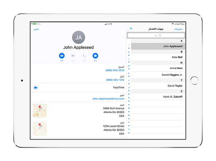
Very often people assume RTL is ‘flipping your interface’s x-axis’, and although this comes close to the result, there is a bit more to that. What it means is that you switch the order most elements are laid out in from LTR, to RTL. In a more general way, you switch the definitions of next and previous. The next element of something is on the left, the previous element is on the right. So in a tab bar, the element that previously was the left most element now becomes the right most element.
In an interface that supports both text directions, words like left and right get confusing quickly and are also no longer accurate. Speaking about previous and next elements makes more sense since they are independent of the interface direction. On iOS, the previous and next elements are called leading and trailing elements, respectively, Android uses start and end. These words are all independent of actual directions, and they also illustrate a bit better what laying out elements in your interface are usually about: ordering UI elements. I.e. you don’t want to place a button to the right of a text field, what you actually want to do is to place it after the text field, to follow the flow of the user; they first enter something into the text field, then they tap the button to confirm. The ‘correct’ position of that button then depends on whether your UI is laid out LTR or RTL.
The Origin of RTL
You probably did not catch it, but I mentioned that this direction independence is true for ‘most elements’ earlier in this post. Meaning: If you’ve never worked on any RTL user interfaces – just like me before I started this adventure – you’d always have this ‘flip the x-axis’ idea in your head, however, it is not true for all types of elements.
Because the interface direction originated from the writing direction, it also only applies to, in general, some forms of writing, such as text fields, buttons, page or view transitions, etc. UI elements that are laid out in a way that refers to other things such as a timeline(opens in a new tab), (e.g. movie player controls), still have their first element on the left, because the majority of people map time to space in the same way. (The past is on the left or the top, and the future is on the right or the bottom.)
However, this layout is not entirely obvious. In fact, there are people that have a different understanding about how time maps to space(opens in a new tab). Systems such as macOS or iOS do not link time and the writing system together and treat them differently. This is a bit more obvious for elements that are in fact referring to a particular direction, such as a D-pad on a virtual gamepad or arrows that scroll a map view(opens in a new tab). (Tapping the left button should move the character or the map to the left. Words like previous or next don’t apply in these cases.)
Page Binding
Now that we understand what ‘flipping the x-axis’ actually means in this context let’s tackle another myth: ‘The page order in RTL scripts is flipped.’ This is not true. The page order is exactly the same. If you have a book written in a RTL script, you still read the book from the first page to the last page, not the other way around. If you put that book flat on a table, the first page still is the top most, and the last page is the one right on the table. In fact, if it weren’t a book but a stack of paper, you wouldn’t see any difference at all except for the writing itself.
And this is precisely what makes the difference – when you bind the pages together to produce a book you have four options: You can bind the pages on the top, left, bottom or right side of the stack. A book which contains mostly LTR scripts has its page binding on the left. A book which contains mostly RTL scripts has its page binding on the right. That’s the only thing that is different here. It’s how we present a book on a screen that makes it appear flipped.
If you want to lay out pages next to each other (i.e. to be able to scroll through them), again, you need to place them from start to end so that they are laid out from left to right when the book has a LTR page binding, and from right to left if it has a RTL page binding.
Be careful though: this should be independent of the current interface direction. A book written in a RTL script should always be shown right to left, even if your application’s interface is running in left to right direction. The same is true for books that have a LTR binding; they should always be shown left to right, even if your interface is laid out in the right to left direction right now. Otherwise, you quickly end up messing with the layout of the book.
Imagine a magazine with images printed over two pages. Flipping these pages would destroy the image. A PDF document has an option to declare its desired page binding. While Apple’s Preview app currently does not support this, both our framework PSPDFKit(opens in a new tab) and our app PDF Viewer(opens in a new tab) each respect this option if it is set in a PDF, regardless of your current user interface direction.

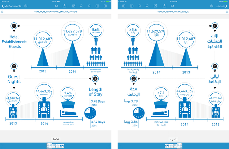
Left image: the English version of a document in PDF Viewer running in English. Right image: PDF Viewer is running in Arabic and showing the Arabic version of the same PDF. Note: the page order is flipped in the bottom because the Arabic version has a right page binding. You can also see how not all content is flipped. For example, the clock symbol is the same in both versions, yet the bed and the overall page layout are mirrored.
A Little Bit of Code
While this blog post deals more with the overall understanding of right to left interfaces, a little bit of code can still help to understand how things work. iOS and Android work very similar in this regard. We’ll pick iOS for example and see how things work there. The good news is if you are already using auto layout and properly refer to leading and trailing instead of left and right, there is a good chance you are already done.
NSLayoutConstraint.activate([    // make the leading side of label 1 be equal to the leading side of the superview    label1.leadingAnchor.constraint(equalTo: view.leadingAnchor),
    // make the leading side of label 2 be equal to the trailing side of label 2 with a padding of 10 between them    label2.leadingAnchor.constraint(equalTo: label1.trailingAnchor, constant: 10.0),
    // make the trailing side of label 2 be equal to the trailing side of the superview    label2.trailingAnchor.constraint(equalTo: view.trailingAnchor),])
[NSLayoutConstraint activateConstraints:@[ // make the leading side of label 1 be equal to the leading side of the superview [label1.leadingAnchor constraintEqualToAnchor:view.leadingAnchor],
// make the leading side of label 2 be equal to the trailing side of label 2 with a padding of 10 between them [label2.leadingAnchor constraintEqualToAnchor:label1.trailingAnchor constant:10.0],
// make the trailing side of label 2 be equal to the trailing side of the superview [label2.trailingAnchor constraintEqualToAnchor:view.trailingAnchor],]];This code lays out two labels next to each other. label1 is the first one and followed by label2. In a LTR interface direction, this makes label1 the left and label2 the right label. In a RTL interface direction, this would result in label2 being on the left and label1 being on the right. As long as you are in a context that refers to the writing system.
There are options to change this behavior as well, for example when writing your own movie player controls, but there is a good chance you won’t need them for the majority of apps.
Summary
While working on this, I was soon fascinated by the history of right to left writing systems and what implications the writing system has on culture. Read a couple of the references I linked above; it is very mind opening.
There is a large number of people worldwide that use right to left scripts. Not supporting this would shrink your potential user base and exclude a whole group of people from using your app. Thanks to modern APIs in mobile operating systems, it is not very hard to implement right to left support and most things will work out of the box. Android has native support for RTL interfaces since Android 4.2 (Jelly Bean), and it even warns when using directions like left and right, instead of start and end. On iOS, the support for RTL got very easy with the introduction of AutoLayout in iOS 6 and has improved a lot since. Only for special UI components like custom playback controls or virtual gamepads, you need to do a bit of extra work. So go ahead and make your app support right to left interfaces, it’s easier than you think!
We do the same in our PDF Viewer for iOS and Android(opens in a new tab), go check it out!


