The Experience of Signing Electronically
Table of contents

Electronic signatures have been a big part of the effort to digitize workflows inside companies and in our personal lives. They’re an environmentally friendly paperless solution, and they speed up processes and save money by us not having to print documents and deliver them to other parties for signing.
The importance of being able to sign documents digitally has become even more pronounced with the huge rise of remote working we’ve seen since the COVID-19 pandemic hit. According to a Gartner survey(opens in a new tab) from June 2020, 82 percent of company leaders plan to allow employees to work remotely some of the time once the pandemic is over, which means electronic workflows will continue to be important in the workplace.
So in this article, we’ll look at what’s important for digitizing the signing experience and cover how we aimed to achieve that with our new Electronic Signatures component. After that, we’ll explore the ways you can customize the experience for your use case.
What Does a Signature Mean?
The act of signing a document is often connected to important moments in our lives, like starting a new job, getting married, giving birth, or renting a new apartment. Those few moves we make with our hands mean more than just ink on paper; they carry our identities, and with them, we make commitments and promises. And we need to be aware that by transferring those situations to the digital space, we’re also transferring experiences and emotions connected to them.
Electronic signatures have been around for a long time, so it’s likely we’ve all had some kind of experience with them. But they aren’t always tied to meaningful moments; in fact, the signing experience can sometimes leave us disappointed. For example, recall a time you received a package and had to sign the tablet held by the courier with one hand while holding the package in the other. I’ve been there, and it seems those awkward scribbles on a poor-quality touchscreen could have been made by anyone, which makes me wonder what the point of a signature is. By not being able to capture my own unique signature, my trust in the process is undermined. And it’s not just me: There are even studies that show that when people don’t feel like a signature represents them, they tend to minimize the binding nature of it(opens in a new tab).
For that reason, it was important to us when designing our new Electronic Signatures component that we created a space where users are able to leave a mark in the digital world that is truly their own.
Signatures Options
To begin, we had to think about how users are signing. Our PDF SDK is used on all kinds of devices — you might sign a document on a mobile phone, tablet, or desktop; it might be your own device or it might be someone else’s; a stylus might be available or it might not be. All these situations require different ideal workflows. In the end, we decided to include three types of signatures to cover all of these situations.
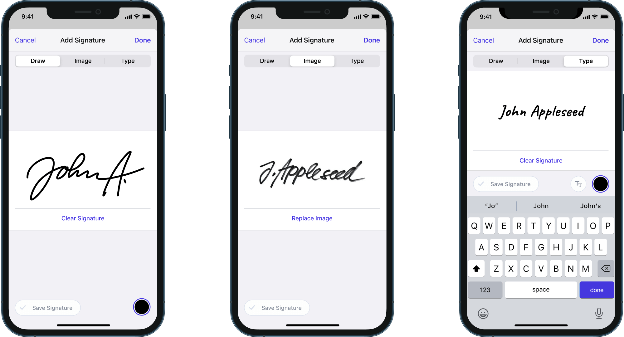
Drawn signatures are most appropriate when you’re using a touchscreen. Using a finger is not going to be as neat as a typed signature, but it’s more personal. But if you have a stylus available on your device, you’d be able to transfer the experience of signing with a pen on paper to the screen almost exactly.
Image signatures are perfect for scenarios when you’re using your own device and using the signature quite frequently. You only need to go through the process of signing with a pen on paper, and then scanning and editing and saving your signature once, and then you’re basically set to use this same signature on all documents in the future.
We also included the typed signature option since it’s the most accessible way to sign, it’s compatible with screen readers, and it can be easily used in any situation — whether you’re signing on your own device or someone else’s. You just type your signature and select a style that represents your personality the most. It’s a good option for when a stylus isn’t available and you need to sign quickly and you don’t want to go through the entire process of scanning a signature.
Since touchscreens are so prevalent these days, and since signing documents by drawing is the most natural to us, drawing has taken the prime position in our UI.
User Interface
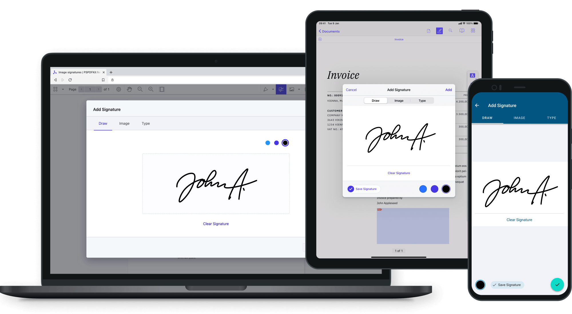
Although some signature options are more appropriate on certain types of devices, we unified the feature set across platforms, with a specific UI on each platform that follows platform conventions. This way, it’s up to the user to decide which signature type is most appropriate for them at any given moment.
Adaptive Design
The layout of the signing module adapts to how much space is available on the screen, making the styling options more discoverable in larger areas, while enabling users to sign as quickly as possible in smaller areas. This is most noticeable with typed signatures, in which the UI includes a list of options for styling and changing the color. And in cases where there’s no hardware keyboard attached to the device, a keyboard needs to appear in the same screen area as well.
When there’s not enough space, like on smaller mobile devices or when in landscape mode, our primary goal is to enable users to sign as quickly as possible, which means we focus on the signature area being clear and having enough space, and on compressing the styling options into buttons with popover menus.
As soon as there’s more space available — for example, after dismissing the keyboard — the styling options expand.
Dark Mode
Like all of our PDF SDKs, the UI also comes in dark mode. Most of the UI area changes to dark mode, but since documents have, in most cases, a white background, making the signing area dark didn’t make much sense. To best reflect how a signature will look on a document, we kept the signing area relatively light in appearance.
Customization Options
For cases where perhaps only certain types of signatures are appropriate, we offer a lot of customization options.
Tabs
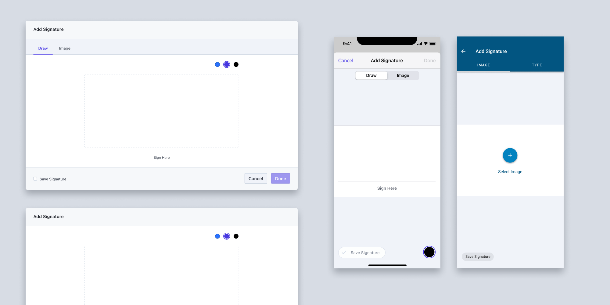
If your use case requires only one or two types of signatures, you can omit the ones you don’t need, and the UI will adjust accordingly. You can also change the order of the tabs if there’s one type of signature you prefer over the other(s).
Typed Signature Styles
We selected four signature styles by choosing fonts from Google Fonts that are licensed under the Open Font License. You can use Caveat(opens in a new tab), Pacifico(opens in a new tab), Marck Script(opens in a new tab), and Meddon(opens in a new tab) freely in your products and projects, which means you don’t need to purchase any additional license for using them. We selected script fonts that mimic handwriting and that have a wide character range and therefore support a lot of languages. These four styles are also quite versatile, so they enable users to select the ones that fit their personalities best. You can easily change the styles by changing the list of fonts, and we designed the UI in a way that works with selecting as many styles as you want.
Colors
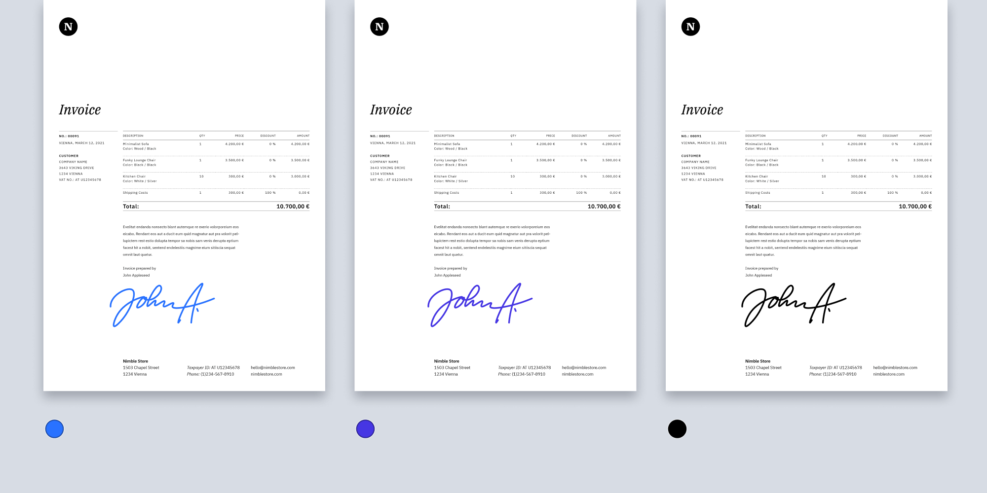
Our UI comes with three predefined color swatches for drawn and typed signatures. We selected black and two shades of blue, since those are the most common options for signing contracts. Although using black ink color for signing is common and certainly useful, some institutions demand that the color of the signature doesn’t match the text color of the document, which is usually black, so as to avoid doubts of the document not being original (photocopied), and also to stand out from the rest of the text. The color that should be avoided is red, since this color is perceived as a warning color in some cultures. It also doesn’t copy or scan that well, since it disappears in some cases due to red laser lights in scanners.
Drawn Signatures
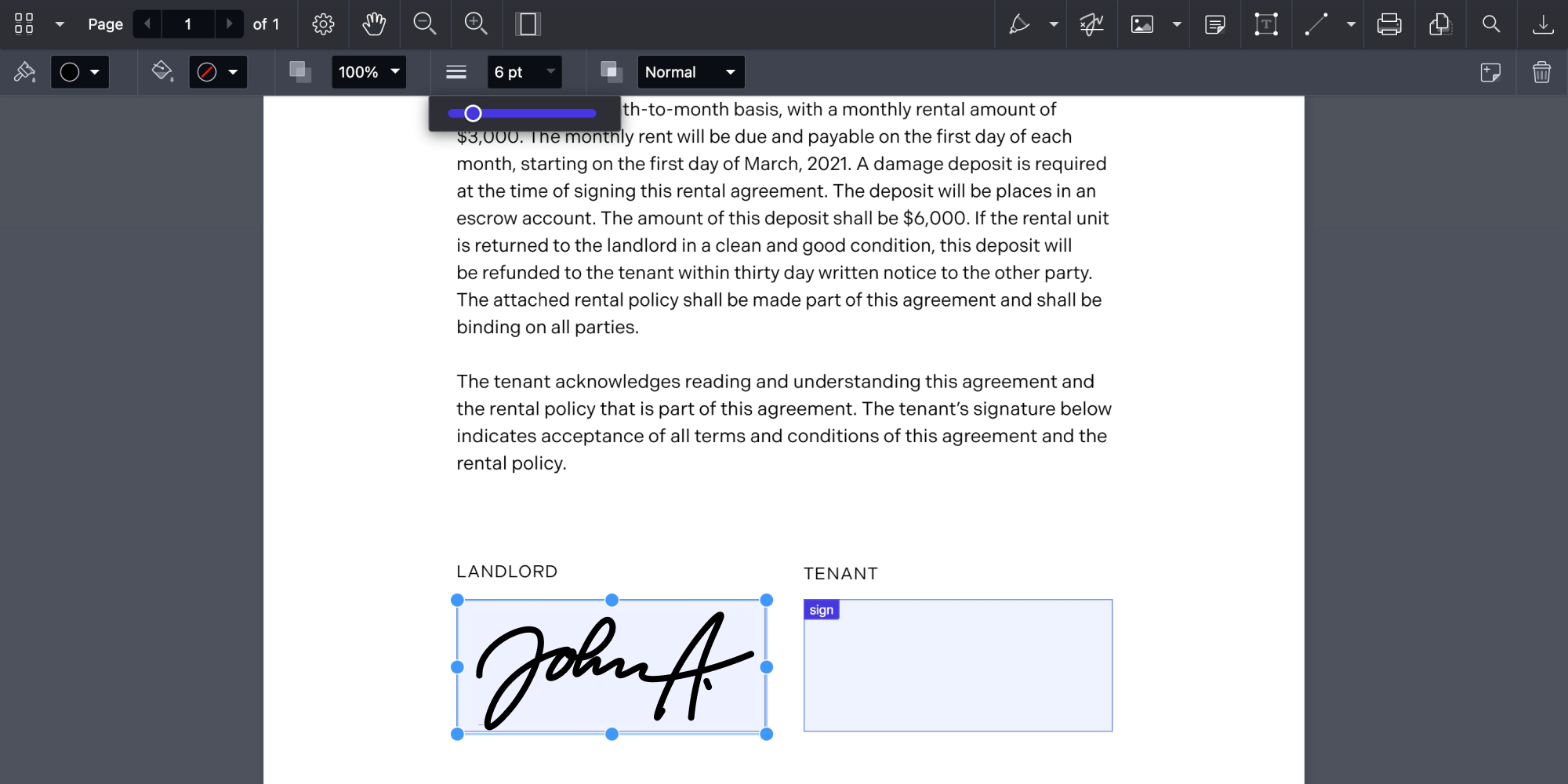
Drawn signatures can be customized further by the user if combined with our Annotations component. This will enable them to adjust properties such as line thickness or opacity after adding a signature to a document.
Saving Signatures
For cases when users will be using the signature multiple times on the same device, you can enable signature saving. By doing this, signatures can be saved to your backend and then loaded again the next time the user wants to use their signature.
Conclusion
Electronic signatures are a convenient and quick way to sign documents digitally, but one might wonder — are they safe? Well, they offer the same level of safety as any other hand-drawn signature. For cases when a cryptographic signature is required, we recommend combining our Electronic Signatures component with Digital Signatures, which uses a digital certificate to sign a document.
We designed the new Electronic Signatures UI to provide the most convenient and quick way of signing in all situations where electronic signatures are needed, and also to enable you to customize the user experience for your specific use case. But most of all, we wanted to design a UI that enables a user to capture their personality and translate it to their signature on a document.


