Creating a Compelling Today Widget
Table of contents
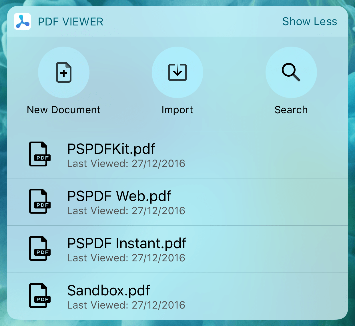
With our latest PDF Viewer update, 1.5(opens in a new tab), we are not only adding Spotlight search, 3D Touch gestures, Wi-Fi Drive, a lot of bug fixes, and improvements, but also a fresh, new Today widget. With App Extensions(opens in a new tab) becoming more and more popular in the Apple ecosystem, developing a Today widget seemed practical. Creating a great user experience as well as a nice design were important to us and are easily done by using UIStackView(opens in a new tab), shared containers and Swift, while also making the widget look at home on both iOS 10 and iOS 9. Read more about the gotchas we had to watch out for.
Getting Started
In this post, you will learn more about best practices and how we achieved the look and behavior of the Today widget for PDF Viewer. I won’t go into details of setting up a Today Extension target, as there are already tutorials explaining that in detail. To get an overview of what exactly Today widgets are, have a look at the Apple Developer documentation(opens in a new tab). We didn’t want to use storyboards, which ended up requiring a small workaround. To remove the storyboard requirement, simply replace the following lines in the Info.plist file:
<key>NSExtension</key><dict> <key>NSExtensionPointIdentifier</key> <string>com.apple.widget-extension</string> <key>NSExtensionMainStoryboard</key> <string>MainInterface</string> <key>NSExtensionPrincipalClass</key> <string>TodayViewController</string></dict>This resulted in an error, because we were using Swift and therefore the TodayViewController class couldn’t be found. Adding @objc(TodayViewController) before the class declaration to make the class correctly visible fixed this small hiccup.
Functionality
We’re handling all the taps and interactions on the Today widget, whether on the action buttons or the recent documents list, using our URL scheme(opens in a new tab). Using open(_:completionHandler:)(opens in a new tab) on your NSExtensionContext(opens in a new tab) lets your containing app handle the URL when using URL schemes, or opens an https link in Safari and potentially use Universal Links(opens in a new tab) to show your app.
Display Mode
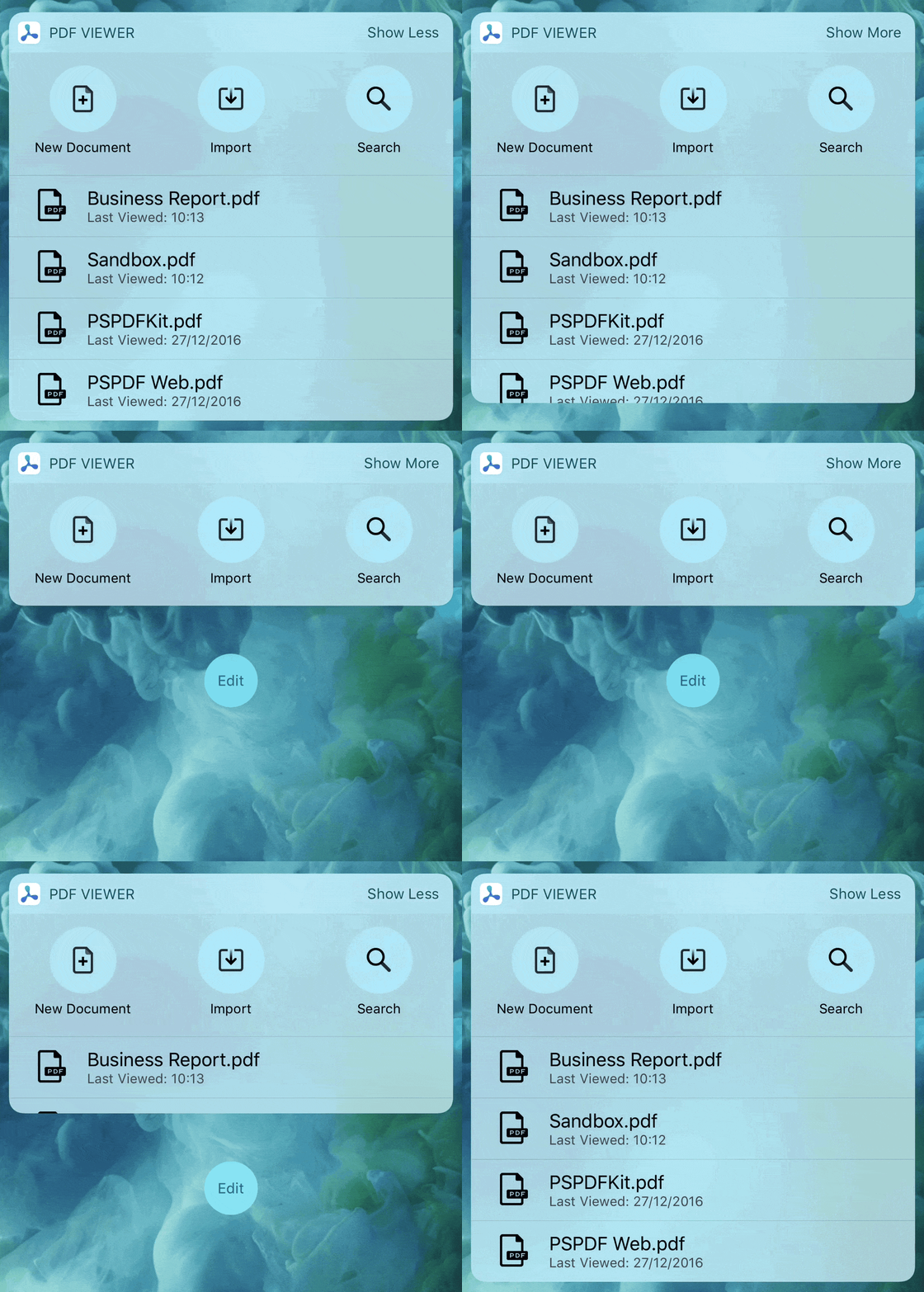
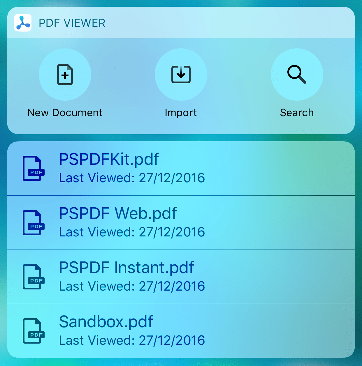
There are two display modes available for an iOS 10 Today widget: Compact and Expanded. You can choose which one you want to enable by setting widgetLargestAvailableDisplayMode(opens in a new tab) of your extension context. If you choose to only allow compact mode in your widget, you get a fixed size, which cannot be changed for your view. If you choose to enable expanded mode, the user can switch between compact and expanded mode by tapping the Show More/Show Less button in the upper right corner of the widget. You get notified about this change using widgetActiveDisplayModeDidChange(_:withMaximumSize:)(opens in a new tab), where you get the display mode the user changed to and the maximum size you can use. It is recommended to adjust preferredContentSize(opens in a new tab) of your view controller to the size that fits your needs (and keep in mind to not exceed the maximum size, as your widget can’t expand past that).
Sharing Data
As we are showing the recently opened documents from the PDF Viewer app inside the Today widget, we needed a way to store this and share it between the containing app and the widget. The widget runs in its own process and has no access to the app’s documents, so we use a shared App Group and store a dictionary of the recent documents in UserDefaults. This is the way Apple suggests(opens in a new tab) handling this scenario. You need to add entitlements for the shared App Group to both your app and the widget target in your project and then access the shared user defaults by using UserDefaults(suiteName: "your.shared.app.group")(opens in a new tab). We always update the list when a document has been opened or when the app is backgrounded. Unfortunately, there is no way to check if a file has been deleted (e.g. through iTunes File Sharing), because the widget has no access to the process of the containing app and therefore can’t check if the document is still available in the file system.
Dynamic Sizing
The size of the Today widget varies depending on many factors: it’s different if the widget is on the left or right column on iPad, if the widget is shown in Notification Center or the Today view, accessed from the Home or Lock screen, portrait or landscape orientation, the users text size setting, and I’m sure there are more factors too. So you need to build your widget in a way that it’s resizable in both directions, vertically and horizontally. As we’re using UIStackView(opens in a new tab) for the action buttons and UITableView(opens in a new tab) for the recent documents list, we only had to worry about vertical space segmentation, letting it handle the horizontal space all by themselves.
Because we are good iOS citizens, we are also supporting dynamic type, which can really change how much size your widget gets by the system. Keep in mind to use UIFont.preferredFont(forTextStyle:)(opens in a new tab) instead of explicitly setting the font size to honor the users text setting.
Varying text sizes also leads to size changes of the Today widget, so never make assumptions about the size by hardcoding the (expected) frame size. Use widgetMaximumSize(for: .compact)(opens in a new tab), if you want to check the compact mode’s maximum size. The default for most devices is a height of 110 in compact mode. The height of the compact widget ranges from 95 (for the tiniest font size) to 140 (for the largest available default font size), and if the user additionally enabled Larger Accessibility Sizes, the height can get up to 325. These heights are applicable to all devices, except the iPad Pro 12.9-inch. The compact height sizes are 112.5/165.0/383.75 respectively on the iPad Pro.
Small Text Size 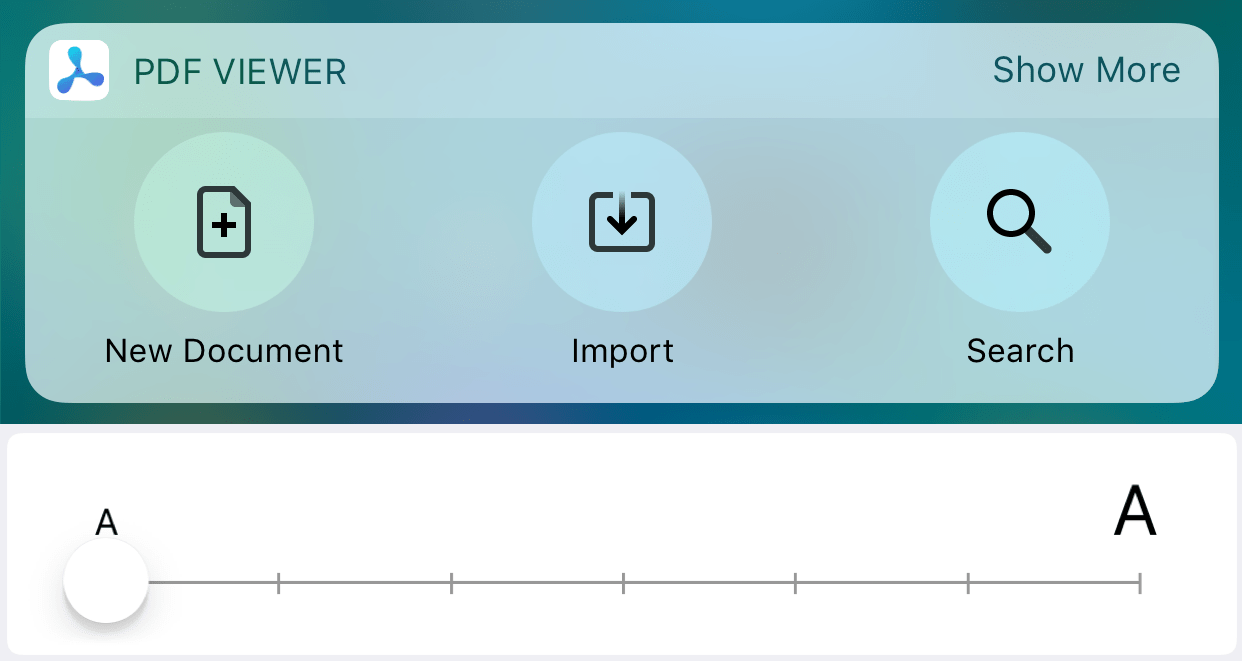
Large Text Size 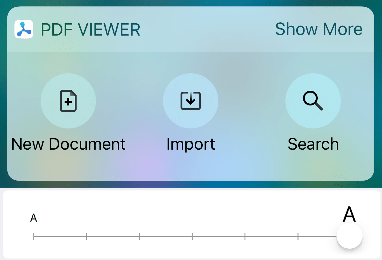
Quick Actions
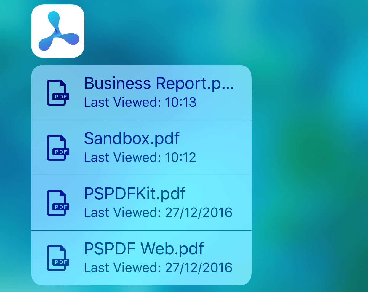
Keep in mind that your widget also shows up when pressing on your app icon along with the Quick Actions. But beware, the widget can only be shown in compact mode. There is no way to expand your widget, so make sure your widget is useful in compact-only mode as well. We took the approach of mirroring our Quick Actions in the expanded Today widget to get a similar behavior, no matter where you view the widget.
Another nice benefit when providing a widget is that your Quick Actions take up the whole screen width (at least when the device is in portrait, the size remains unchanged in landscape) opposed to without a widget, where they only take up approximately two-thirds of the screen width. This is really useful in our case, where document titles are displayed and we have no control of the text length. Therefore the text may be truncated, so some extra space is really appreciated.
Backward Compatibility
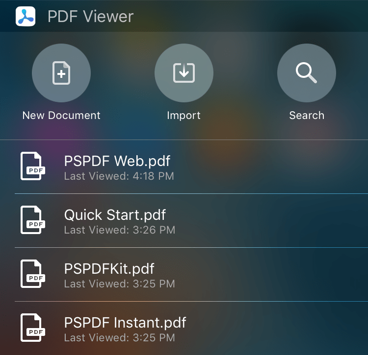
We first started by making the widget look good on iOS 10, and later added backward compatibility for iOS 9. This was actually much easier than expected, we just had to make some layout changes and make sure the correct code is called on each iOS version. On iOS 9 there is no such thing as display modes, so we are always using what is the expanded view on iOS 10 (if there are recent items and the widget has enough space available). We are using a constant for the height of the compact view containing the action buttons, instead of the dynamic height of the compact display mode on iOS 10. We also had to change the colors of the text and images as the background is rather dark on iOS 9 compared to the bright interface on iOS 10. We did this by implementing class properties in a UIColor(opens in a new tab) extension and switch the color based on the current iOS version.
extension UIColor { public class var primaryWidgetColor: UIColor { if #available(iOS 10.0, *) { return .black } else { return .white } }}By default iOS 9 widgets have an edge inset on the leading side. To use the full width and mimic the inset of the iOS 10 widget, implement widgetMarginInsets(forProposedMarginInsets:)(opens in a new tab) and return UIEdgeInsets.zero to disable the default inset. This method will not be called on iOS 10+, so it won’t affect your iOS 10+ layout at all.
Layout
Most of our layout is automatically done by using UIStackView(opens in a new tab)s. To achieve the simplest layout code and not having to deal with manual layout, we nest stack views. The action button and the text beneath is one vertical stack view each using the width of the views frame divided by the number of action buttons (three in our current case). These three stack views are arranged in another horizontal stack view. This stack view, containing the action buttons, has the width of the widget’s frame and the height of the widget in compact mode, to always fill the same space, no matter what display mode is active.
The recent items are displayed as cells in a standard UITableView(opens in a new tab). The table view’s vertical origin starts at the widget’s compact mode height, to exactly pin it to the bottom of the action button stack view. Its width is again the width of the widget and the height is calculated based on how many recent documents are available, displaying a maximum of four documents to not let it grow unreasonably large. Additionally, we calculate how many table view cells fit in the current maximum available size and choose a size that shows a whole number of cells, so we’re not cutting off the last cell.
And that’s basically it, pretty simple, right?
Try It
Check out our free PDF Viewer app(opens in a new tab) to see the Today widget and all the other features and improvements in action. Let us know if you have any feedback or questions on Twitter(opens in a new tab) or by using the feedback button in lower right corner.


